Dankeeeeee ! , now all is OK ,
I writing this Code;
/* Tablet Nexus Width */

@media screen and  (min-width: 39.6875em) and (max-width: 63em) {
  body {
    display: grid;
    grid-template-columns: 11% 75% 14%;
     grid-gap: 5px;
    grid-template-areas:
    "header  header  header"
    "nav     nav     nav"
    "linkBox main    main"
    "footer  footer  footer";
  }

}

/* Tablet Nexus Portrait */

@media screen and (min-width: 30.06em)
              and (max-width: 38.6875em)
              and (orientation: portrait){
    body {

      display: grid;
      grid-template-columns: 17% 70% 13%;
      grid-template-rows: auto auto 70vh auto;
      grid-gap: 5px;
      grid-template-areas:
       "header  header  header"
       "nav     nav     nav"
       "linkBox main    main"
       "footer  footer  footer";
    }
    body > main {
     height: 70vh;
   }
}
body > header {
	grid-area: header;
	background-image: url("/Bilder/nnnn.png");
        background-size: cover;
        background-repeat: no-repeat;
        padding: 80px;
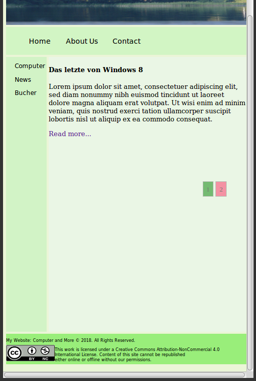
a Screenshot how to see the Tablet …