I’ve been tinkering with this thing, trying with relative units vs fixed (the “58px” thing is almost always going to be a problem), trying with grid/flex containers… and it’s weird. Doing much the same thing. Doesn’t seem to matter whether it’s a mobile or desktop, mostly a function of the screen width. The thing that seems to be killing is the auto adjusting height of the header container.
One thing I strongly recommend is a decent mobile emulator extension for chrome. This will allow me to display in a variety of sizes and formats, but still have access to all the Chrome Dev Tools goodness on my desktop.
For those who may not have worked with it yet, get familiar with the Chrome Developer Tools. If you open the menu in Chrome from a desktop/laptop, then choose ‘More tools…’, you should see ‘Developer tools’. There, you have a number of tabs: Elements, Console, Sources and so on. For what you’re doing here, you’ll want the Elements and the inspector.
This allows for the viewing of the HTML structure (in the left pane), and the CSS driving that (on the right). Not only that (“But wait – there’s more!”) you can edit that CSS and HTML live, right in the ‘Elements’ pane, and the display will automatically update. For what we’re trying to do here, we can see what is adding spacing (the margins on that image, for example), or what the effect of changes are, real time.
Neat thing is, when you are viewing this with the mobile extension I’d mentioned, the Developer tools STILL work, they simply open in a separate window, but they still update real-time as I’m tweaking CSS values!
I am familiar with dev tools and I have set up a few mobile device screen ratios. Am I to understand that the extension linked also adds the extra feature of not just emulating the screen size but also the actual mobile browser app?
Tinkering more to find out. At the moment, I’m on a flip-phone, so ANY mobile emulation is an improvement for me.
At a glance, it does indicate that it uses a “mobile user agent.” If you read the docs in the above link, it changes the response header to include the proper mobile agents. Neat.
Edit: That said, as a test case, I opened my gmail in the emulator – first it logged me out and, when I logged back in, it opened the desktop site in a mobile-size window. So clearly there’s bits missing.
I’m familiar with the dev tools (most of the time I use firefox thought).
I’m not at home right now but I’ll work on it ASAP and come back with feedback about this issue. In the meantime, thanks a lot for this help!
To finish, I got a question: what do you mean by "
"
I really don’t understand what I should get from that message here. Very sorry. If you could reformulate I’m sure I would understand (sorry my english fails me sometimes, I’m not very good at english).
Thanks. I meant my comprehension X).
I took spanish for 5 years at school your native language is awesome by the way. Hit you guys up again when I found something ^^.
So when we open a url in a browser, there is quite a bit going on behind the scenes. The url request also includes headers, telling the server about the browser environment. Among them is a user-agent, which hints to the server what rendering engine this browser might use.
Hey y’all! Just letting you know that I’m working on that problem of my the one named :“NOTE”.
Almost there but I’ll take a break and contact you guys back.
I re-did my nav-container menu from nothing and fixed my “NOTE” problem (view above post for content). All I add to do is give the navcontainer a fixed height in a responsive unit (I used %) make sure my children of nav-container took 100% of the parent (I used a lot of flexbox lol) and then I made the nav ul on mobile and tablet absolute relative to nav-bar which took 100% height so i applied top: 100%; to nav-ul.
I really have no idea how to fix that perfectly but I did my best to make it minimally bad and I think I did fine. Like most mobiles devices won’t have less then 500px in height right?! So my question is really is it a problem is it negligibable at some point?
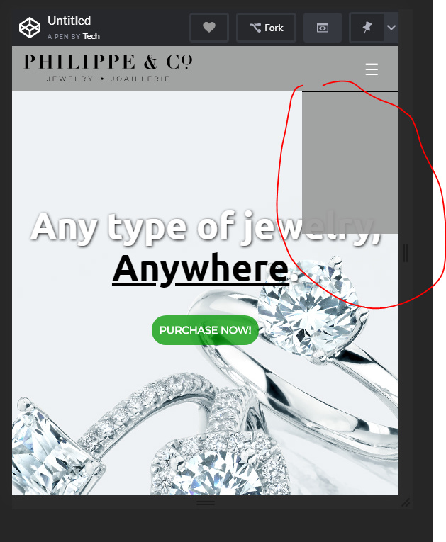
That is the scroll bar, since you are sizing the window smaller than the page it automatically creates a scroll bar,
its a feature of the browser not a problem on your page


 .
.


 :
:
