Hi, looks slick. I didn’t look at your code, but I have a few suggestions:
Spacing
Elements that belong together should look like they belong together.
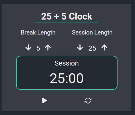
For the most part I think you did a good job, except that the labels and counters are further apart from each other than the counters and the time display, which have nothing to do with each other. This makes parsing the layout a bit more difficult.
Compare your version (above) with my quick hack (h4 { margin-bottom: 8px; }):
Buttons
The buttons below the timer seem a bit lost, as there’s a large gap between them. The horizontally centered layout stops looking good when there’s not much content to adequately occupy the whole width. Since they are associated with the timer, maybe they would look better if you integrated them into the timer itself (to the left or right)?
Counter does not work after starting session
If an option is not available, it should be indicated as such (disabled attribute + style).
A11y
Accessibility is probably not your concern at this point, but I think it should be.
If you’re in the market for a motivational article, see WebAIM: Introduction to Web Accessibility.
You don’t use semantic HTML, your counters are not accessible, you use h4 outside a proper page structure (see Headings • Page Structure • WAI Web Accessibility Tutorials), #start_stop and #reset are not buttons, there are no labels, etc. I don’t mean to give you a hard time, accessibility is just something I care strongly about.
Otherwise, I think this is a good project, for what it’s worth
thank you for your feedback. I will implement your suggestions regarding the spacing and see if I can find some alternate option for positioning buttons. I could grey out the buttons to make it more obvious, when they are not available for use.
Regarding accessibility I actually usually try to adhere to at least some of the accessibility best practices, but this project was honestly pretty tough for me. So I ended up trying out a lot of things to see what works and in the end completely forgot about doing an accessibility check of my code. Thank you for reminding me, I will fix accessibility issues.
Since I am learning on my own, at least for me, it’s often hard to assess whether my project is at least somewhat decent, so whenever anyone says that my project is good, it’s honestly really nice to hear. Thank you very much for your feedback and for saying my project looks good.
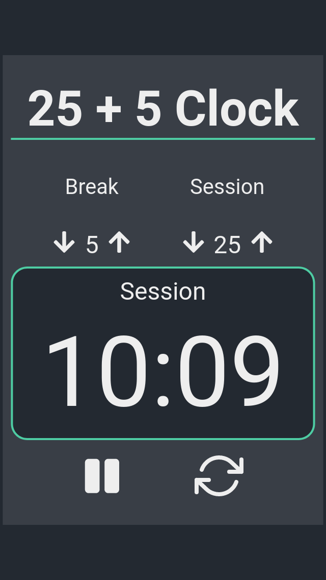
@kpav Nice project. I am using your clock to get my work done. The project looks good and it works which is the most important. My suggestion is to increase the size of the numbers, icons, and text. Maybe you do not need the work length. These are just ideas that I had. I have taken a screenshot in mobile view. You want to maximize the space you have in mobile view. What do you think?
thank you for your feedback. I will try out increased sizes and see how I like it. Regarding the mobile view, I did plan to change it a bit, by making it occupy more space like you mentioned.
You can also make the background color change during break time.
Another thing is that you can add a sound effect when switching from work time to break time as an audio queue.