What do you think of my survey page?
Great!
Your form controls are just a little bit on the right side.
Your form meets all technical requirements. I would take some time to address some layout issues that might make the form hard to follow and to apply some aesthetic styling.
Some of the controls seem out of line and very far from their labels. I believe the css grid styling is what pushes these so far apart and to the right.
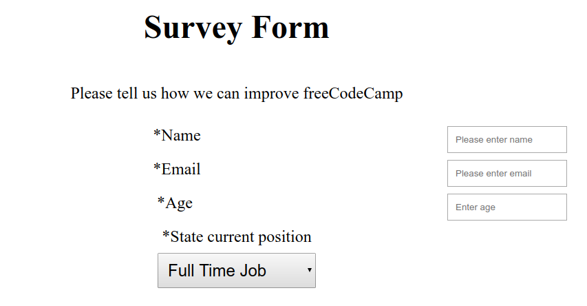
At smaller screen your radio buttons stack in a way that it is unclear which goes to which label. I think keeping them to the side of the labels would be clearer

I implemented the changes you suggested, are there any further things I should change?
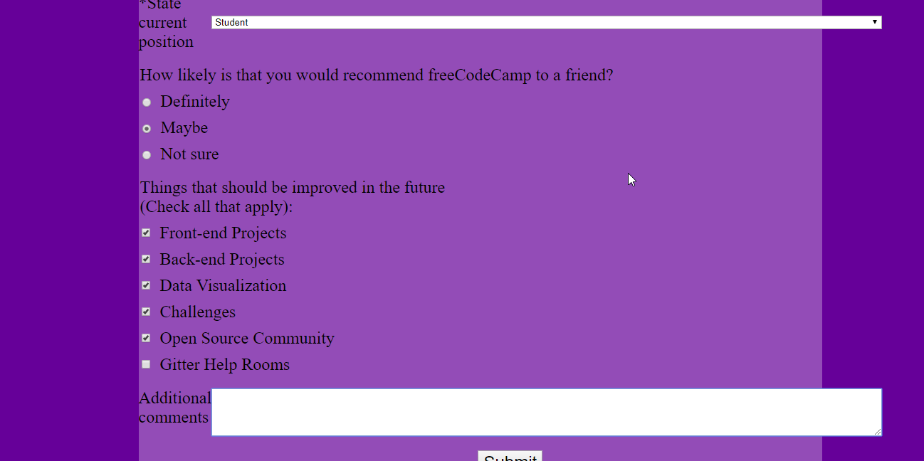
Good, you can add some colors 
Put some background-color to form and body and maybe small border-radius to form.
Ok, added color and border-radius.
Hi.
-
I tried to resize your textarea and what I got.
-
Really hard to see which input is active because the caret is too close to the left border of your inputs. Give it bigger paddings. Don’t forget to make it
box-sizing: border-box;Read more about it at CSS Box Sizing.

-
The text is hard to read. Take a look at the next article Seven Principles of Typographic Contrast.
-
Make your inputs higher at mobile viewports and I wouldn’t make it as blocks because it is hard to understand this is the input anyway.

-
You can use pxs for your fonts but it’d be better to use relative units to make your typography look better at mobile viewports. Read the next article Responsive Design with CSS Viewport Units
You can also make style textarea to go only on height. I suggesting using bootstrap for : Bootstrap forms
OK, I think I fixed the issues that you pointed out.