Cuéntanos qué está pasando:
Blockquote Tu elemento #navbar debe estar siempre en la parte superior del viewport.
Tu código hasta el momento
<!-- file: index.html -->
<!DOCTYPE HTML>
<html lang="en">
  <html>
    <head>
      <meta charset="utf-8"/>
      <meta name="viewport" content="width=device-width, initial-scale=1"/>
      <meta http-equiv="X-UA-Compatible" content="ie=edge">
      <title id="title"></title>
  <link rel="stylesheet" href="styles.css" @media screen and (min-width: 800px)>
      <enlace rel="preconectar" href="https://fonts.googleapis.com">
<enlace rel="preconectar" href="https://fonts.gstatic.com" crossorigin>
      <enlace href="https: //fonts.googleapis.com/css2? family= Raleway:ital@1 & display=swap" rel="hoja de estilo">
</head>
<body>
   <header>
  <nav id="navbar"><a href="#">Metodos de pago</a></br>
 </header>
  <sections id="projects"></section></br></br>
<p class="project-tile"><strong>EL BUEN GUSTO</strong></p><a href id="profile-link" target="_blank"></br>Ordena tu compra</a></br>

</nav>
 <section id="welcome-section"><h1>Bienvenidos</h1></section>
<sections id="projects">Bodegon con los mejores precios</section>
<div class="project-tile"></br>
<ol>
  <li>Carnes</li>
  <li>Viveres</li>
  <li>Legumbres</li>
  <li>Lacteos</li>
  <li>Enseres y art. de limpieza</li>
</ol>


</body>
</html>
/* file: styles.css */
familia tipográfica: 'Raleway', sans-serif;
body {
  width: 100%;
  font-size: 1em;
  flex-box: display;
  background-color: cyan;
}


@media screen and (min-width: 800px), projection

header {
  position: fixed;
  width: 100%;
}

.project-tile {
  display: block;
  float: left;
  width: 100px;
  margin-right: 75px;
  color: #00F;
  text-decoration: red;
  height: auto;
}
li:hover {
      -moz-box-shadow:    1px 1px 10px 1px #DDDDDD;
      box-shadow:         1px 1px 10px 1px #DDDDDD;
  }


.p {
  font-size: 0.5em;
  line-height: 1.5;
}

ul li:first-child {
      font-size: 5px;
    }

nav{
text-aling: center;
}

#nav-bar {
  position: fixed;
}
Información de tu navegador:
El agente de usuario es: Mozilla/5.0 (Windows NT 10.0; Win64; x64) AppleWebKit/537.36 (KHTML, like Gecko) Chrome/106.0.0.0 Safari/537.36
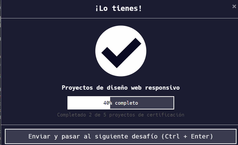
Desafío: Proyectos de diseño web responsivo - Construye una página portafolio personal
Enlaza al desafío:
Learn to Code — For Free
Tienes algunos errores tipográficos en tu código css y en el código html
Este paso no lo estás haciendo
Tu elemento #navbar debe estar siempre en la parte superior del viewport.
Revisa tu código css y los nombres que estás utilizando
ok lo pude acomodar en parte, creo que este error es usual
<!DOCTYPE HTML>
<html lang="en">
  <html>
    <head>
      <meta charset="utf-8"/>
      <meta name="viewport" content="width=device-width, initial-scale=1"/>
      <meta http-equiv="X-UA-Compatible" content="ie=edge">
      <title id="title"></title>
  <link rel="stylesheet" href="styles.css" @media screen and (min-width: 800px)>
      <enlace rel="preconectar" href="https://fonts.googleapis.com">
<enlace rel="preconectar" href="https://fonts.gstatic.com" crossorigin>
      <enlace href="https: //fonts.googleapis.com/css2? family= Raleway:ital@1 & display=swap" rel="hoja de estilo">
</head>
<body>
  <nav id="navbar"><section id="welcome-section"><h1>Bienvenidos</h1></section><a href="#">Metodos de pago</a></br>
  <header>
  <sections id="projects"></section></br></br>
<p class="project-tile"><strong>EL BUEN GUSTO</strong></p><a href id="profile-link" target="_blank"></br>Ordena tu compra</a></br>
</header>
</nav>
<sections id="projects">Bodegon con los mejores precios</section>
<div class="project-tile"></br>
<ol>
  <li>Carnes</li>
  <li>Viveres</li>
  <li>Legumbres</li>
  <li>Lacteos</li>
  <li>Enseres y art. de limpieza</li>
</ol>


</body>
</html>
y el css…
familia tipográfica: 'Raleway', sans-serif;

#nav-bar {
position: fixed;
}

flex-box: display;

header {
  position: absolute;
}

body {
  width: 100%;
  font-size: 1em;
  background-color: cyan;
}

@media screen and (min-width: 800px), projection

.project-tile {
  display: block;
  float: left;
  width: 100px;
  margin-right: 75px;
  color: #00F;
  text-decoration: red;
  height: auto;
}

li:hover {
      -moz-box-shadow:    1px 1px 10px 1px #DDDDDD;
      box-shadow:         1px 1px 10px 1px crimson;
  }


.p {
  font-size: 0.5em;
  line-height: 1.5;
}

ul li:first-child {
      font-size: 5px;
    }
En las partes donde tienes el subrayado de color hay errores
Y respecto al #navbar revisa como lo tienes escrito
Entiendo y de hecho cambié el navbar pero no se como a mi el header me sale que esta bien
Cuál es código ya editado?
<!DOCTYPE HTML>
<html lang="en">
  <html>
    <head>
      <meta charset="utf-8"/>
      <meta name="viewport" content="width=device-width, initial-scale=1"/>
      <meta http-equiv="X-UA-Compatible" content="ie=edge">
      <title id="title"></title>
  <link rel="stylesheet" href="styles.css" @media screen and (min-width: 800px)>
      <enlace rel="preconectar" href="https://fonts.googleapis.com">
<enlace rel="preconectar" href="https://fonts.gstatic.com" crossorigin>
      <enlace href="https: //fonts.googleapis.com/css2? family= Raleway:ital@1 & display=swap" rel="hoja de estilo">
</head>
<body>
  <nav id="navbar"><section id="welcome-section"><h1>Bienvenidos</h1></section><a href="#">Metodos de pago</a></br></br></br></br>
  <header>
  <sections id="projects"></section></br></br>
<p class="project-tile"></br><strong>EL BUEN GUSTO</strong></p><a href id="profile-link" target="_blank"></br>Ordena tu compra</a></br>
</header>
</nav>
<sections id="projects">Bodegon con los mejores precios</section>
<div class="project-tile"></br></br></br>
<ol>
  <li>Carnes</li>
  <li>Viveres</li>
  <li>Legumbres</li>
  <li>Lacteos</li>
  <li>Enseres y art. de limpieza</li>
</ol>


</body>
</html>

#navbar {
position: fixed;
}

familia tipográfica: 'Raleway', sans-serif;


flex-box: display;

header {
  position: absolute;
}

body {
  width: 100%;
  font-size: 1em;
  background-color: cyan;
}

@media screen and (min-width: 800px), projection

.project-tile {
  display: block;
  float: left;
  width: 100px;
  margin-right: 75px;
  color: #00F;
  text-decoration: red;
  height: auto;
}

li:hover {
      -moz-box-shadow:    1px 1px 10px 1px #DDDDDD;
      box-shadow:         1px 1px 10px 1px crimson;
  }


.p {
  font-size: 0.5em;
  line-height: 1.5;
}

ul li:first-child {
      font-size: 5px;
    }
El código sigue teniendo errores, pero ya pasa todas las pruebas
@media screen and (min-width: 800px), projection
Este media query tiene una sintaxis incorrecta
familia tipográfica: 'Raleway', sans-serif;
Esta línea está incorrecta también, no se recomienda utilizar acentos