I am stuck in this portfolio thing cause I’m a little perfectionist and I see others Portfolios page on this “challange” and I look at mine and I see that it sucks and I delete everything and start over. Months in this and I have not yet reached the level I desire. I don’t accept that.
I was looking at this portfolio:
And I don’t understand how he did this very wide sections, which occupy the entire screen and this colour changes. I tried some things, but nothing.
@JacksonBates Already gave the answer but if you use chrome (alt + shift + i) and press the element selector button or the icon with a box with an arrow in it
It panel on the right can give you more information about how the creator made the sections that big.
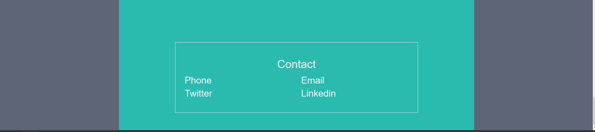
I understand, I think. But I can’t see where the hell he uses it. I look everything and I can’t identify where is the code to do this, where the code to do this blue and white thing. Exemplo, I tried what he did at the very end, in “Contact”. Green and such. But the green isn’t in the whole area!!! Look: