karll
February 18, 2023, 3:18pm
1
Why is my radio and select not working? and I can’t seem to centre the radio and select input elements:
My code so far
body {
  background-color:#263C58;
  width: 100%;
  height: 100vh;
  margin: 0 auto;
  font-family: Tahoma;
  font-size: 16px;
  color:#DAF7A6;
}
#title,#description{
 margin: 1em auto;
 text-align: center;

}
p{
   margin: 1em auto;
   text-align: center;
}

form {
  width: 60vw;
  max-width: 500px;
  min-width: 300px;
  margin: 0 auto;
  padding-bottom: 2em;
  background-color:#1C3049 ;
  border:5px solid #FF5733;
  border-radius: 25px;
}


fieldset {
  border: none;
  padding: 1rem 0;

}
label {
  display: block;
  margin: 0.5rem 0;
}


#name, #email,#number {
  width: 50%;
  padding: 12px 20px;
  margin: 8px 0;
  box-sizing: border-box;
  border: none;
  border-bottom: 2px solid #FFC300;
  background-color: #1C3049;

}

 textarea {
  width: 50%;
  box-sizing: border-box;
  background-color: #1C3049;
  border: none;
  border-bottom: 2px solid #FFC300;
  color: #FFC300;

}


#submit{
  display: block;
  width: 60%;
  margin: 1em auto;
  height: 2em;
  font-size: 1.1rem;
  background-color: #FFC300;
  border-color: #FF5733 ;
  min-width: 300px;
  color:#1C3049;
}

#submit {
  padding: 1px 2px;
}

/* dropdown */
#dropdown{
  width: 50%;
  padding: 12px;
  border: 2px solid #FF5733;
  border-radius: 4px;
  resize: vertical;
  background-color:#FFC300;
}
/* The container */
.container {
  display: block;
  position: relative;
  padding-left: 35px;
  margin-bottom: 12px;
  cursor: pointer;
  -webkit-user-select: none;
  -moz-user-select: none;
  -ms-user-select: none;
  user-select: none;
}

/* Hide the browser's default checkbox */
input[type="checkbox"] {
  visibility: hidden;

}
/* Create a custom checkbox */
.checkmark {
  position: absolute;
  top: 0;
  left: 0;
  height: 25px;
  width: 25px;
  background-color: #FFC300;
}

/* On mouse-over, add a grey background color */
.container:hover input ~ .checkmark {
  background-color: #EE321C;
}

/* When the checkbox is checked, add a blue background */
.container input:checked ~ .checkmark {
  background-color: #FF5733;
}

/* Create the checkmark/indicator (hidden when not checked) */
.checkmark:after {
  content: "";
  position: absolute;
  display: none;
}

/* Show the checkmark when checked */
.container input:checked ~ .checkmark:after {
  display: block;
}

/* Style the checkmark/indicator */
.container .checkmark:after {
  left: 9px;
  top: 5px;
  width: 5px;
  height: 10px;
  border: solid #FFC300;
  border-width: 0 3px 3px 0;
  -webkit-transform: rotate(45deg);
  -ms-transform: rotate(45deg);
  transform: rotate(45deg);
}

/* The container for radio*/
.contain {
  display: block;
  position: relative;
  padding-left: 35px;
  margin-bottom: 12px;
  cursor: pointer;
  -webkit-user-select: none;
  -moz-user-select: none;
  -ms-user-select: none;
  user-select: none;
}

/* Hide the browser's default radio button */
input[type="radio"] {
  visibility: hidden;

}

/* Create a custom radio button */
.checkmarked {
  position: absolute;
  top: 0;
  left: 0;
  height: 25px;
  width: 25px;
  background-color: #FFC300;
  border-radius: 50%;
}

/* On mouse-over, add a grey background color */
.contain:hover input ~ .checkmarked {
  background-color: #EE321C;
}

/* When the radio button is checked, add a blue background */
.contain input:checked ~ .checkmark {
  background-color: #FF5733;
}

/* Create the indicator (the dot/circle - hidden when not checked) */
.checkmarked:after {
  content: "";
  position: absolute;
  display: none;
}

/* Show the indicator (dot/circle) when checked */
.contain input:checked ~ .checkmarked:after {
  display: block;
}

/* Style the indicator (dot/circle) */
.contain .checkmarked:after {
 	top: 9px;
	left: 9px;
	width: 8px;
	height: 8px;
	border-radius: 50%;
	background: white;
}

/*center TT */
fieldset {
   margin: 0 auto;
   text-align: center;
}


.inline {
  width: unset;
  margin: 0 0.5em 0 0;
  vertical-align: middle;
  padding-left: 30px;
}
html:
<!DOCTYPE html>
<html lang="en">
  <head>
    <title> Survey </title>
    <meta charset="UTF-8">
    <link rel="stylesheet" href="styles.css">
  </head>
  <body>
    <!-- title and description-->
    <h1 id="title">FreeCodeCamp Survey Form</h1>
    <p id="description">Thank you for taking the time to help us improve the platform</p>
    <!-- form-->
    <form method="post" action='https://register-demo.freecodecamp.org'id="survey-form">
<fieldset>
<label id="name-label"> Name <input required id="name"type="text"placeholder="Enter your name"></label>
 <label id="email-label">Email<input required id="number" type="email"placeholder="Enter your email"></label>
 <label id="number-label">Age <input id="number" type="number" min="18" max="120" placeholder="Age"></label>
    </fieldset>
    <fieldset>
      <!--Dropdown-->
    <label>Which option best describes your current role?</label>
    <select id="dropdown" name="feature">
       <option id="dropdown" value="" disabled select>Select a current role</option>
      <option value="Student" id="dropdown" > Student </option>
      <option value="Full-time-Job" id="dropdown"> Full time job </option>
      <option value="Full-time-Learner" id="dropdown"> Full time learner </option>
      <option value="Prefer-not-to-say" id="dropdown"> Prefer not to say </option>
      <option value="Other" id="dropdown">Other </option>
    </select>

    <!--radio-->
    <p>Would you recommend freeCodeCamp to a friend?</p>

       <label for="recommend" class="contain">Definitely
       <input type="radio" name="Definitely">
       <span class="checkmarked" class="inline"></span>
       </label>


       <label for ="recommend" class="contain">Maybe
       <input type="radio" name="Maybe">
       <span class="checkmarked" class="inline"></span>
       </label>


       <label for ="recommend" class="contain">"Not sure"
       <input type="radio" name="Not-sure">
       <span class="checkmarked"class="inline"></span>
       </label>


    </fieldset>


  <!--dropdown-->

    <fieldset>
    <label>What is your favorite feature of freeCodeCamp?</label>
    <select id="dropdown" name="feature">
       <option value="" disabled select> Select a current role</option>
      <option value="Challenges"> Challenges </option>
      <option value="Projects"> Projects </option>
      <option value="Community"> Community </option>
      <option value="Open Source"> Open Source </option>
    </select>

 <!-- Checkbox-->
    <p id="recommendations">What would you like to see improved?</p>
     <label class="container" for="improved"> Front-end Projects
     <input type="checkbox"  name="Front-end-Projects">
     <span class="checkmark" class="inline"></span>
     </label>

     <label class="container" for="improved"> Back-end Projects
     <input type="checkbox"  name="Back-end-Projects">
     <span class="checkmark" class="inline"></span>
     </label>

     <label class="container" for="improved"> Data-Visualization
     <input type="checkbox"   name="Data-Visualization">
     <span class="checkmark"class="inline"></span>
     </label>

     <label class="container" for="improved"> Challenges
     <input type="checkbox" name="Challenges">
     <span class="checkmark" class="inline"></span>
     </label>

      <!-- Textbox-->

<label id="textbox" for="comments">Any comments or suggestions? <textarea  rows="3" cols="30" placeholder="Enter your comment here.."> </textarea> </label>
    </fieldset>

    <!-- Submit-->
     <input type="submit" value="Submit" id="submit" />
    </form>
  </body>
</html>
My browser information: Google Chrome *
User Agent is: Mozilla/5.0 (Macintosh; Intel Mac OS X 10_15_7) AppleWebKit/537.36 (KHTML, like Gecko) Chrome/110.0.0.0 Safari/537.36
Challenge: Survey Form - Build a Survey Form
Link to the challenge:
hbar1st
February 18, 2023, 3:45pm
2
I’ve edited your code for readability. When you enter a code block into a forum post, please precede it with a separate line of three backticks and follow it with a separate line of three backticks to make it easier to read.
You can also use the “preformatted text” tool in the editor (</>) to add backticks around text.
See this post to find the backtick on your keyboard.Note: Backticks (`) are not single quotes (').
hbar1st
February 18, 2023, 3:48pm
3
First thing I would do, copy the html code to an online html validator and fix all the errors reported. This would help make it easier to identify the real issues (versus the ones caused by syntax mistakes).
here’s an online validator that I like to use
1 Like
karll
February 18, 2023, 6:19pm
4
i tired that but i still can’t find where i went wrong it says my CSS is okay
hbar1st
February 18, 2023, 6:23pm
5
did you paste your html code into it?
karll
February 18, 2023, 7:43pm
6
<!DOCTYPE html>
<html lang="en">
  <head>
    <title> Survey </title>
    <meta charset="UTF-8">
    <link rel="stylesheet" href="styles.css">
  </head>
  <body>
    <!-- title and description-->
    <h1 id="title">FreeCodeCamp Survey Form</h1>
    <p id="description">Thank you for taking the time to help us improve the platform</p>
    <!-- form-->
    <form method="post" action='https://register-demo.freecodecamp.org' id="survey-form">
        <fieldset>

         <label id="name-label" for="name-label">  Name <input required id="name" type="text" placeholder="Enter your name"  value="name" ></label>
         <label id="email-label" for="email-label" >Email<input required id="email" type="email" placeholder="Enter your email" value="email" ></label>
         <label id="number-label" for="name-label" >Age <input id="number" type="number" min="18" max="120" placeholder="Age" value="age" ></label>

      <fieldset>

      <fieldset>
        <!--Dropdown-->
        <label>Which option best describes your current role?</label>
        <select id="dropdown" for="feature">
          <option value="" disabled select  >Select a current role</option>
          <option value="Student"> Student </option>
          <option value="Full-time-Job"> Full time job </option>
          <option value="Full-time-Learner"> Full time learner </option>
          <option value="Prefer-not-to-say"> Prefer not to say </option>
          <option value="Other">Other </option>
        </select>

        <!--radio-->
       <p>Would you recommend freeCodeCamp to a friend?</p>

       <label for="recommend" class="contain">Definitely
       <input type="radio" value="Definitely">
       <span class="checkmarked" class="inline"></span>
       </label>


       <label for ="recommend" class="contain">Maybe
       <input type="radio" value="Maybe">
       <span class="checkmarked" class="inline"></span>
       </label>


       <label for ="recommend" class="contain">"Not sure"
       <input type="radio" value="Not-sure">
       <span class="checkmarked"class="inline"></span>
       </label>


      </fieldset>


      <fieldset>
        <!--dropdown-->
          <label>What is your favorite feature of freeCodeCamp?</label>
            <select id="dropdown" for="feature">
             <option value="" disabled select> Select a current role</option>
             <option value="Challenges"> Challenges </option>
             <option value="Projects"> Projects </option>
             <option value="Community"> Community </option>
             <option value="Open Source"> Open Source </option>
            </select>

         <!-- Checkbox-->
         <p id="recommendations">What would you like to see improved?</p>
             <label class="container" for="improved"> Front-end Projects
             <input type="checkbox"  value="Front-end-Projects">
             <span class="checkmark" class="inline"></span>
             </label>

             <label class="container" for="improved"> Back-end Projects
             <input type="checkbox"  value="Back-end-Projects">
             <span class="checkmark" class="inline"></span>
             </label>

             <label class="container" for="improved"> Data-Visualization
             <input type="checkbox"   value="Data-Visualization">
             <span class="checkmark"class="inline"></span>
             </label>

             <label class="container" for="improved"> Challenges
             <input type="checkbox" value="Challenges">
             <span class="checkmark" class="inline"></span>
            </label>

           <!-- Textbox-->

            <label id="textbox" for="comments">Any comments or suggestions? <textarea  rows="3" cols="30" placeholder="Enter your comment here.."> </textarea> </label>
       </fieldset>

    <!-- Submit-->
     <input type="submit" value="Submit" id="submit" />


    </form>
  </body>
</html>
CSS
body {
    background-color:#263C58;
    width: 100%;
    height: 100vh;
    margin: 0 auto;
    font-family: Tahoma;
    font-size: 16px;
    color:#DAF7A6;
  }
  #title,#description{
   margin: 1em auto;
   text-align: center;

  }
  p{
     margin: 1em auto;
     text-align: center;
  }

  form {
    width: 60vw;
    max-width: 500px;
    min-width: 300px;
    margin: 0 auto;
    padding-bottom: 2em;
    background-color:#1C3049 ;
    border:5px solid #FF5733;
    border-radius: 25px;
  }


  fieldset {
    border: none;
    padding: 1rem 0;

  }
  label {
    display: block;
    margin: 0.5rem 0;
  }


  #name, #email,#number {
    width: 50%;
    padding: 12px 20px;
    margin: 8px 0;
    box-sizing: border-box;
    border: none;
    border-bottom: 2px solid #FFC300;
    background-color: #1C3049;

  }

   textarea {
    width: 50%;
    box-sizing: border-box;
    background-color: #1C3049;
    border: none;
    border-bottom: 2px solid #FFC300;
    color: #FFC300;

  }


  #submit{
    display: block;
    width: 60%;
    margin: 1em auto;
    height: 2em;
    font-size: 1.1rem;
    background-color: #FFC300;
    border-color: #FF5733 ;
    min-width: 300px;
    color:#1C3049;
  }

  #submit {
    padding: 1px 2px;
  }

  /* dropdown */
  #dropdown{
    width: 50%;
    padding: 12px;
    border: 2px solid #FF5733;
    border-radius: 4px;
    resize: vertical;
    background-color:#FFC300;
  }
  /* The container */
  .container {
    display: block;
    position: relative;
    padding-left: 35px;
    margin-bottom: 12px;
    cursor: pointer;
    -webkit-user-select: none;
    -moz-user-select: none;
    -ms-user-select: none;
    user-select: none;
  }

  /* Hide the browser's default checkbox */
  input[type="checkbox"] {
    visibility: hidden;

  }
  /* Create a custom checkbox */
  .checkmark {
    position: absolute;
    top: 0;
    left: 0;
    height: 25px;
    width: 25px;
    background-color: #FFC300;
  }

  /* On mouse-over, add a grey background color */
  .container:hover input ~ .checkmark {
    background-color: #EE321C;
  }

  /* When the checkbox is checked, add a blue background */
  .container input:checked ~ .checkmark {
    background-color: #FF5733;
  }

  /* Create the checkmark/indicator (hidden when not checked) */
  .checkmark:after {
    content: "";
    position: absolute;
    display: none;
  }

  /* Show the checkmark when checked */
  .container input:checked ~ .checkmark:after {
    display: block;
  }

  /* Style the checkmark/indicator */
  .container .checkmark:after {
    left: 9px;
    top: 5px;
    width: 5px;
    height: 10px;
    border: solid #FFC300;
    border-width: 0 3px 3px 0;
    -webkit-transform: rotate(45deg);
    -ms-transform: rotate(45deg);
    transform: rotate(45deg);
  }

  /* The container for radio*/
  .contain {
    display: block;
    position: relative;
    padding-left: 35px;
    margin-bottom: 12px;
    cursor: pointer;
    -webkit-user-select: none;
    -moz-user-select: none;
    -ms-user-select: none;
    user-select: none;
  }

  /* Hide the browser's default radio button */
  input[type="radio"] {
    visibility: hidden;

  }

  /* Create a custom radio button */
  .checkmarked {
    position: absolute;
    top: 0;
    left: 0;
    height: 25px;
    width: 25px;
    background-color: #FFC300;
    border-radius: 50%;
  }

  /* On mouse-over, add a grey background color */
  .contain:hover input ~ .checkmarked {
    background-color: #EE321C;
  }

  /* When the radio button is checked, add a blue background */
  .contain input:checked ~ .checkmark {
    background-color: #FF5733;
  }

  /* Create the indicator (the dot/circle - hidden when not checked) */
  .checkmarked:after {
    content: "";
    position: absolute;
    display: none;
  }

  /* Show the indicator (dot/circle) when checked */
  .contain input:checked ~ .checkmarked:after {
    display: block;
  }

  /* Style the indicator (dot/circle) */
  .contain .checkmarked:after {
       top: 9px;
      left: 9px;
      width: 8px;
      height: 8px;
      border-radius: 50%;
      background: white;
  }

  /*center TT */
  fieldset {
     margin: 0 auto;
     text-align: center;
  }


  .inline {
    width: unset;
    margin: 0 0.5em 0 0;
    vertical-align: middle;
    padding-left: 30px;
  }
hbar1st
February 18, 2023, 7:46pm
7
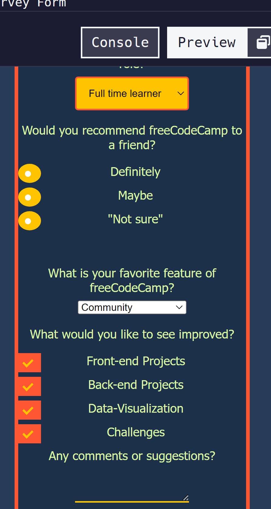
when I put your code into the html validator I get a lot of error messages still.
fyi, I took a bit of time and fixed all the errors just to see if they would help or not and I found that once the syntax issues were gone, the radio buttons were working perfectly (so was the select dropdown) Here’s a screenshot of how it looked for me after I fixed the errors. (you would still need to modify the layout of course, but once the errors are fixed, it will be easier to handle that)
(you can see I selected all the buttons based on the color change in the middle of the yellow dots and the check mark in the middle of the orange squares)
1 Like
karll
February 18, 2023, 8:40pm
8
I think it should be better now
<!DOCTYPE html>

<html lang="en">


  <head>
    <title> Survey </title>
    <meta charset="UTF-8">
    <link rel="stylesheet" href="styles.css">
  </head>
  <body>
    <!-- title and description-->
    <h1 id="title">FreeCodeCamp Survey Form</h1>
    <p id="description">Thank you for taking the time to help us improve the platform</p>
    <!-- form-->
    <form method="post" action='#' id="survey-form">


        <fieldset>

         <label  for="name-label">  Name <input required id="name-label" type="text" placeholder="Enter your name" ></label>
         <label  for="email-label" >Email<input required id="email-label" type="email" placeholder="Enter your email" ></label>
         <label  for="number-label" >Age <input id="number-label" type="number" min="18" max="120" ></label>

        </fieldset>

      <fieldset>
        <!--Dropdown-->
        <label>Which option best describes your current role?</label>
        <select id="dropdown">
          <option value="" disabled >Select a current role</option>
          <option value="Student"> Student </option>
          <option value="Full-time-Job"> Full time job </option>
          <option value="Full-time-Learner"> Full time learner </option>
          <option value="Prefer-not-to-say"> Prefer not to say </option>
          <option value="Other">Other </option>
        </select>

        <!--radio-->
       <p>Would you recommend freeCodeCamp to a friend?</p>

       <label class="contain">Definitely
       <input type="radio" value="Definitely">
       <span class="checkmarked"></span>
       </label>


       <label class="contain">Maybe
       <input type="radio" value="Maybe">
       <span class="checkmarked" ></span>
       </label>


       <label class="contain">"Not sure"
       <input type="radio" value="Not-sure">
       <span class="checkmarked"></span>
       </label>


      </fieldset>


      <fieldset>
        <!--dropdown-->
          <label>What is your favorite feature of freeCodeCamp?</label>
            <select id="droped">
             <option value="" disabled> Select a current role</option>
             <option value="Challenges"> Challenges </option>
             <option value="Projects"> Projects </option>
             <option value="Community"> Community </option>
             <option value="Open Source"> Open Source </option>
            </select>

         <!-- Checkbox-->
         <p id="recommendations">What would you like to see improved?</p>
             <label class="container" > Front-end Projects
             <input type="checkbox"  value="Front-end-Projects">
             <span class="checkmark"></span>
             </label>

             <label class="container" > Back-end Projects
             <input type="checkbox"  value="Back-end-Projects">
             <span class="checkmark"></span>
             </label>

             <label class="container" > Data-Visualization
             <input type="checkbox"   value="Data-Visualization">
             <span class="checkmark"></span>
             </label>

             <label class="container" > Challenges
             <input type="checkbox" value="Challenges">
             <span class="checkmark"></span>
            </label>

           <!-- Textbox-->

            <label id="textbox">Any comments or suggestions? <textarea  rows="3" cols="30" placeholder="Enter your comment here.."> </textarea> </label>
       </fieldset>

       <!-- Submit-->
       <input type="submit" value="Submit" id="submit" >


    </form>
  </body>
</html>
CSS
    background-color:#263C58;
    width: 100%;
    height: 100vh;
    margin: 0 auto;
    font-family: Tahoma;
    font-size: 16px;
    color:#DAF7A6;
  }
  #title,#description{
   margin: 1em auto;
   text-align: center;

  }
  p{
     margin: 1em auto;
     text-align: center;
  }

  form {
    width: 60vw;
    max-width: 500px;
    min-width: 300px;
    margin: 0 auto;
    padding-bottom: 2em;
    background-color:#1C3049 ;
    border:5px solid #FF5733;
    border-radius: 25px;
  }


  fieldset {
    border: none;
    padding: 1rem 0;

  }
  label {
    display: block;
    margin: 0.5rem 0;
  }


  #name-label, #email-label,#number-label {
    width: 50%;
    padding: 12px 20px;
    margin: 8px 0;
    box-sizing: border-box;
    border: none;
    border-bottom: 2px solid #FFC300;
    background-color: #1C3049;

  }

   textarea {
    width: 50%;
    box-sizing: border-box;
    background-color: #1C3049;
    border: none;
    border-bottom: 2px solid #FFC300;
    color: #FFC300;

  }


  #submit{
    display: block;
    width: 60%;
    margin: 1em auto;
    height: 2em;
    font-size: 1.1rem;
    background-color: #FFC300;
    border-color: #FF5733 ;
    min-width: 300px;
    color:#1C3049;
  }

  #submit {
    padding: 1px 2px;
  }

  /* dropdown */
  #dropdown, #droped{
    width: 50%;
    padding: 12px;
    border: 2px solid #FF5733;
    border-radius: 4px;
    resize: vertical;
    background-color:#FFC300;
  }
  /* The container */
  .container {
    display: block;
    position: relative;
    padding-left: 35px;
    margin-bottom: 12px;
    cursor: pointer;
    -webkit-user-select: none;
    -moz-user-select: none;
    -ms-user-select: none;
    user-select: none;
  }

  /* Hide the browser's default checkbox */
  input[type="checkbox"] {
    visibility: hidden;

  }
  /* Create a custom checkbox */
  .checkmark {
    position: absolute;
    top: 0;
    left: 0;
    height: 25px;
    width: 25px;
    background-color: #FFC300;
  }

  /* On mouse-over, add a grey background color */
  .container:hover input ~ .checkmark {
    background-color: #EE321C;
  }

  /* When the checkbox is checked, add a blue background */
  .container input:checked ~ .checkmark {
    background-color: #FF5733;
  }

  /* Create the checkmark/indicator (hidden when not checked) */
  .checkmark:after {
    content: "";
    position: absolute;
    display: none;
  }

  /* Show the checkmark when checked */
  .container input:checked ~ .checkmark:after {
    display: block;
  }

  /* Style the checkmark/indicator */
  .container .checkmark:after {
    left: 9px;
    top: 5px;
    width: 5px;
    height: 10px;
    border: solid #FFC300;
    border-width: 0 3px 3px 0;
    -webkit-transform: rotate(45deg);
    -ms-transform: rotate(45deg);
    transform: rotate(45deg);
  }

  /* The container for radio*/
  .contain {
    display: block;
    position: relative;
    padding-left: 35px;
    margin-bottom: 12px;
    cursor: pointer;
    -webkit-user-select: none;
    -moz-user-select: none;
    -ms-user-select: none;
    user-select: none;
  }

  /* Hide the browser's default radio button */
  input[type="radio"] {
    visibility: hidden;

  }

  /* Create a custom radio button */
  .checkmarked {
    position: absolute;
    top: 0;
    left: 0;
    height: 25px;
    width: 25px;
    background-color: #FFC300;
    border-radius: 50%;
  }

  /* On mouse-over, add a grey background color */
  .contain:hover input ~ .checkmarked {
    background-color: #EE321C;
  }

  /* When the radio button is checked, add a blue background */
  .contain input:checked ~ .checkmark {
    background-color: #FF5733;
  }

  /* Create the indicator (the dot/circle - hidden when not checked) */
  .checkmarked:after {
    content: "";
    position: absolute;
    display: none;
  }

  /* Show the indicator (dot/circle) when checked */
  .contain input:checked ~ .checkmarked:after {
    display: block;
  }

  /* Style the indicator (dot/circle) */
  .contain .checkmarked:after {
       top: 9px;
      left: 9px;
      width: 8px;
      height: 8px;
      border-radius: 50%;
      background: white;
  }

  /*center TT */
  fieldset {
     margin: 0 auto;
     text-align: center;
  }


type or paste code here
hbar1st
February 18, 2023, 9:32pm
10
okay, so I worked on it a bit and unfortunately I didn’t find that it was an easy fix.
If it was something small I could tell you exactly but since it isn’t, I have to just describe the strategy I used, but you will have to implement it.
I noticed you had some reliance on absolute positioning and values in the .contain and .checkmark and .checkmark::after. I dropped these and used regular settings when needed. For eg. I used a margin setting to place the white dot in the middle of the circle without using absolute positioning.
Then I applied a flex layout onto the labels (the .contain). I had to reverse the layout in order for the circles to appear to the left of the text.
After that I created a new container div around the label elements that belong to the same question and gave it a class attribute. Then in the css I used the class name I just made to assign an inline-grid layout.
Anyway, it was a bunch of steps just for the top radio buttons.
Sorry I couldn’t help you with direct code as this is a certification project.
1 Like
karll
February 19, 2023, 12:01am
11
Thats okay your way sounds much easier. I ended up figuring out through trial and error.
<!DOCTYPE html>
<html lang="en">
<head>
<title> Survey </title>
<meta charset="UTF-8">
<link rel="stylesheet" href="styles.css">
</head>
<body>
<!-- title and description-->
<h1 id="title">FreeCodeCamp Survey Form</h1>
<p id="description">Thank you for taking the time to help us improve the platform</p>
<!-- form-->
<form method="post" action='#' id="survey-form">
<fieldset class="Firstsection">
<label for="name-label"> Name <input required id="name-label" type="text" placeholder="Enter your name" ></label>
<label for="email-label" >Email<input required id="email-label" type="email" placeholder="Enter your email" ></label>
<label for="number-label" >Age <input id="number-label" type="number" min="18" max="120" placeholder="Enter your age" ></label>
</fieldset>
<fieldset>
<!--Dropdown-->
<label id="dropdown-label">Which option best describes your current role?</label>
<select id="dropdown">
<option value="" disabled >Select a current role</option>
<option value="Student"> Student </option>
<option value="Full-time-Job"> Full time job </option>
<option value="Full-time-Learner"> Full time learner </option>
<option value="Prefer-not-to-say"> Prefer not to say </option>
<option value="Other">Other </option>
</select>
<!--radio-->
<p>Would you recommend freeCodeCamp to a friend?</p>
<label class="contain">Definitely
<input type="radio" value="Definitely">
<span class="checkmarked"></span>
</label>
<label class="contain">Maybe
<input type="radio" value="Maybe">
<span class="checkmarked" ></span>
</label>
<label class="contain"> Not sure
<input type="radio" value="Not-sure">
<span class="checkmarked"></span>
</label>
</fieldset>
<fieldset>
<!--dropdown-->
<label id="dropped-label">What is your favorite feature of freeCodeCamp?</label>
<select id="droped">
<option value="" disabled> Select a current role</option>
<option value="Challenges"> Challenges </option>
<option value="Projects"> Projects </option>
<option value="Community"> Community </option>
<option value="Open Source"> Open Source </option>
</select>
<!-- Checkbox-->
<p id="recommendations">What would you like to see improved?</p>
<label class="container" > Front-end Projects
<input type="checkbox" value="Front-end-Projects">
<span class="checkmark"></span>
</label>
<label class="container" > Back-end Projects
<input type="checkbox" value="Back-end-Projects">
<span class="checkmark"></span>
</label>
<label class="container" > Data-Visualization
<input type="checkbox" value="Data-Visualization">
<span class="checkmark"></span>
</label>
<label class="container" > Challenges
<input type="checkbox" value="Challenges">
<span class="checkmark"></span>
</label>
<!-- Textbox-->
<label id="textbox">Any comments or suggestions? <textarea rows="3" cols="30" placeholder="Speak your mind.." > </textarea> </label>
</fieldset>
<!-- Submit-->
<input type="submit" value="Submit" id="submit" >
</form>
<p> © LALA_sharon </p>
</body>
</html>
CSS
body {
    background-color:#263C58;
    width: 100%;
    height: 100vh;
    margin: 0 auto;
    font-family: Tahoma;
    font-size: 16px;
    color:#DAF7A6;
  }
  #title,#description{
   margin: 1em auto;
   text-align: center;

  }
  p{
     margin: 1em auto;
     text-align: center;
  }

  form {
    width: 60vw;
    max-width: 500px;
    min-width: 300px;
    margin: 0 auto;
    padding-bottom: 2em;
    background-color:#1C3049 ;
    border:5px solid #FF5733;
    border-radius: 25px;
  }


  fieldset {
    border: none;
    padding: 1rem 0;

  }
  label {
    display: block;
    margin: 0.5rem 0;
  }


  #name-label, #email-label,#number-label {
    width: 50%;
    padding: 12px 20px;
    margin: 8px 0;
    box-sizing: border-box;
    border: none;
    border-bottom: 2px solid #FFC300;
    background-color: #1C3049;

  }

   textarea {
    width: 50%;
    box-sizing: border-box;
    background-color: #1C3049;
    border: none;
    border-bottom: 2px solid #FFC300;

  }


  #submit{
    display: block;
    width: 60%;
    margin: 1em auto;
    height: 2em;
    font-size: 1.1rem;
    background-color: #FFC300;
    border-color: #FF5733 ;
    min-width: 300px;
    color:#1C3049;
  }


  /* dropdown */
  #dropdown, #droped{
    width: 50%;
    padding: 12px;
    border: 2px solid #FF5733;
    border-radius: 4px;
    resize: vertical;
    background-color:#FFC300;
  }
  /* The container */
  .container {
    display: block;
    position: relative;
    padding-left: 35px;
    margin-bottom: 12px;
    cursor: pointer;
    -webkit-user-select: none;
    -moz-user-select: none;
    -ms-user-select: none;
    user-select: none;
  }

  /* Hide the browser's default checkbox */
  input[type="checkbox"] {
    visibility: hidden;

  }
  /* Create a custom checkbox */
  .checkmark {
    position: absolute;
    top: 0;
    left: 0;
    height: 25px;
    width: 25px;
    background-color: #FFC300;
  }

  /* On mouse-over, add a grey background color */
  .container:hover input ~ .checkmark {
    background-color: #EE321C;
  }

  /* When the checkbox is checked, add a blue background */
  .container input:checked ~ .checkmark {
    background-color: #FF5733;
  }

  /* Create the checkmark/indicator (hidden when not checked) */
  .checkmark:after {
    content: "";
    position: absolute;
    display: none;
  }

  /* Show the checkmark when checked */
  .container input:checked ~ .checkmark:after {
    display: block;
  }

  /* Style the checkmark/indicator */
  .container .checkmark:after {
    left: 9px;
    top: 5px;
    width: 5px;
    height: 10px;
    border: solid #FFC300;
    border-width: 0 3px 3px 0;
    -webkit-transform: rotate(45deg);
    -ms-transform: rotate(45deg);
    transform: rotate(45deg);
  }

  /* The container for radio*/
  .contain {
    display: block;
    position: relative;
    padding-left: 35px;
    margin-bottom: 12px;
    cursor: pointer;
    -webkit-user-select: none;
    -moz-user-select: none;
    -ms-user-select: none;
    user-select: none;
  }

  /* Hide the browser's default radio button */
  input[type="radio"] {
    visibility: hidden;

  }

  /* Create a custom radio button */
  .checkmarked {
    position: absolute;
    top: 0;
    left: 0;
    height: 25px;
    width: 25px;
    background-color: #FFC300;
    border-radius: 50%;
  }

  /* On mouse-over, add a grey background color */
  .contain:hover input ~ .checkmarked {
    background-color: #EE321C;
  }

  /* When the radio button is checked, add a blue background */
  .contain input:checked ~ .checkmark {
    background-color: #FF5733;
  }

  /* Create the indicator (the dot/circle - hidden when not checked) */
  .checkmarked:after {
    content: "";
    position: absolute;
    display: none;
  }

  /* Show the indicator (dot/circle) when checked */
  .contain input:checked ~ .checkmarked:after {
    display: block;
  }

  /* Style the indicator (dot/circle) */
  .contain .checkmarked:after {
       top: 9px;
      left: 9px;
      width: 8px;
      height: 8px;
      border-radius: 50%;
      background: white;
  }

  /*centering TT */
  .Firstsection {
     margin: 0 auto;
     text-align: center;
  }
  #dropdown,#droped{
    left: 50% !important;
    right: 0 !important;
    text-align: center !important;
    transform: translate(50%, 0) !important;

  }

  #dropdown-label, #dropped-label{
    margin: 0 auto;
    text-align: center;
    margin-bottom: 20px;
  }


  .contain,.container{

    margin-right: 15%;
    margin-left: 40%;

}

.contain,.container{
   display: inline-block;
   vertical-align:top;
   text-align: center;
}

#textbox{
  text-align: center;

}

::placeholder {
  color: rgb(186, 171, 121);
  font-family: Tahoma;
}
Not exactly what was asked, I was just having fun
1 Like
system
August 20, 2023, 12:01pm
12
This topic was automatically closed 182 days after the last reply. New replies are no longer allowed.