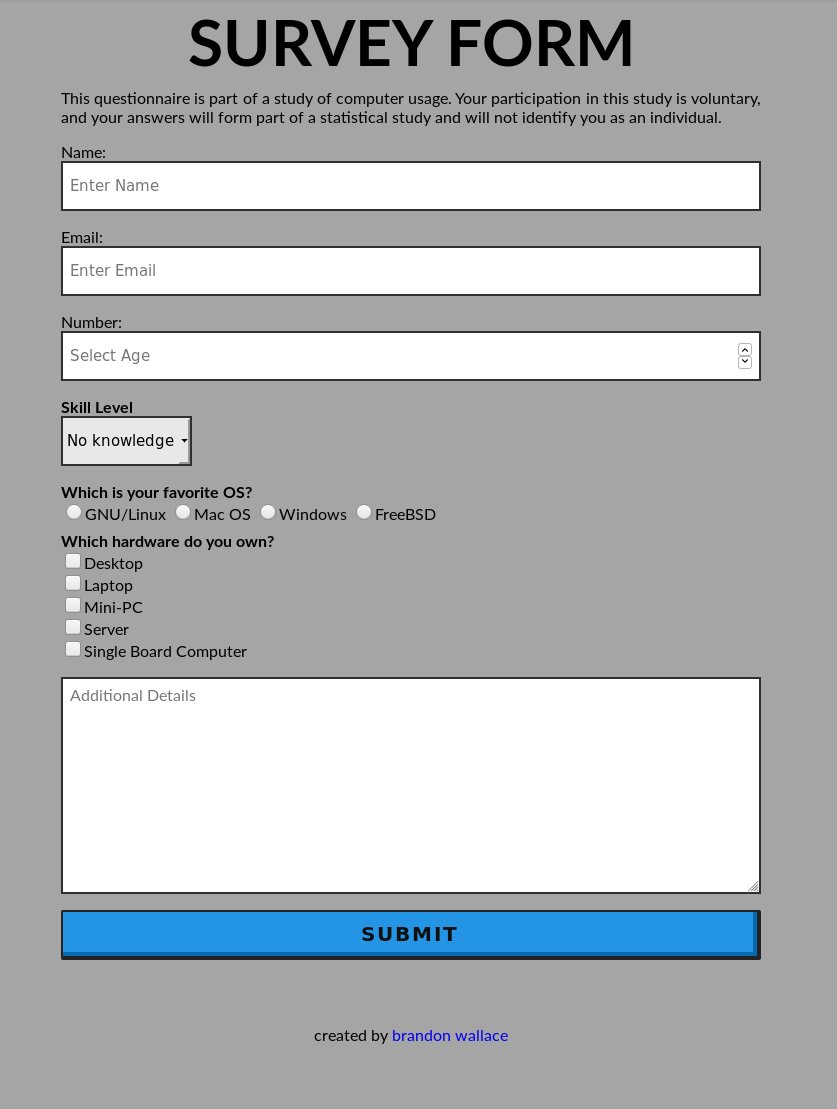
It looks so severe…why not add a border radius of 4px to your inputs to soften it a little? It will still look professional and you rounded one field, the Select (albiet 2px).
Why ‘number’? You’re asking for an age so why not title it age??
You really don’t need ‘footer p’. You could have put that text-align: center; in the footer and gotten the same effect.
For as austere as your form is, your submit button seems out of place with all that styling.
I see a styling for a class named spacer but I don’t see that class anywhere in your HTML
Wow! Thank you Roma for taking the time to check my webpage so thoroughly.
I have seen so much border-radius that I decided to bring square corners back. LOL.
I put “Number” there by mistake. I meant to write age. I will change it.
I used “footer p” because I am targeting the text within the ‘p’ tag.
@TazExprez@Roma@nourdineessail My original idea behind this webpage was to make a page with as little CSS as possible. I was going for plain and simple. I got a little carried away with the button. The background was supposed to be white but I really liked the grey. I think the design a bit.
Thank you all for your suggestions.
No problem, glad to help. Just my opinion, make sure you choose colors that have enough contrast. If your title did not have a shadow effect, it would have been hard to distinguish the title name from the background color. Try an analogous color if you don’t want to much contrast.
I liked the grey and the plain and simple. Just thought the submit button could have been toned down to match the rest of the page.
Seems to flow better with the blue now too.
Still like it.
@Roma I decided to make the rest of the page match the button since the grey was a bit dull looking. I think it looks better now.
@lukeMersh I have passed the tests so I think that I will leave ithem out since little green hamburger menu or yellow window does not go along with my design.
Updated! I made a lot of changes. It looked dull when I first posted my survey. View the picture I posted compared to what it looks like now. What do you ladies/guys think?
@michelmarechal I have already passed the tests. I removed the test because I do not like the green hamburger menu to be visible on my webpage. I got the Responsive Web Design certificate because I completed the projects. my certificate
I have since made changes and updated projects to improve the look and functionality. I would like to get feedback if possible on the how the page looks/functions now.