Technical Documentation Page - using grid to position fixed elements; WHY does it work? šŸ¤”

Finally got to register to the forum to present my Technical Documentation Page :tada:

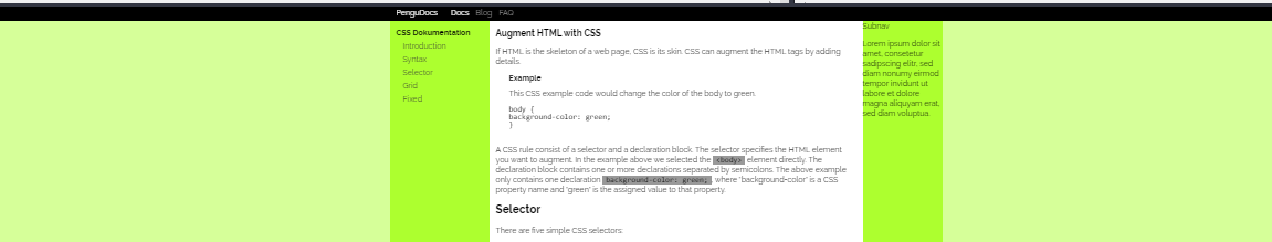
I wanted to have a fixed menu bar at the top and two fixed menu bars on the left and right of my scrollable main content. I somehow got it to work by placing my elements in a grid-layout and assigning a fixed element as a child.
Why does this work thought? I thought fixed would remove the element from the DOM, so it should be unaffected by the grid - no?


I get, that my nav-containers ( nav-top-container , nav-docs-container , and subnav-container ) are basically empty shells. I use them to position my fixed navigation bars ( .nav-top-container .fixed , nav-docs , and subnav ) inside the grid. Which seems to be working - and that is where I wonder why. Sorry for not making it clear in the original post (please be kind, it was my first :see_no_evil:)

(Added 2019-11-26T23:00:00Z)


Another question:
I somehow struggle with my nav-doc links, which point to my sections in .main-content. If I click on a link, the 1st heading of the section is always ā€œeaten upā€. I’m out of ideas on how to fix this… Your help is much appreciated :slight_smile:

(Added 2019-11-28T23:00:00Z)


I appreciate your comments :slight_smile:
Thank you :heart:

2 Likes

I’ve indented your code to improve readability as I try to explain what’s happening. Here’s the relavent code that we’re looking at. By the way, in Codepen, you don’t need DOCTYPE, and if you open the HTML setting button at the top left, you’ll see there is a section to put everything for your head inside of.

<body>
    <div class ="nav-top-full_width_background"></div>    

    <div class="grid-container">
        <div class ="nav-top-container">
           <div class="fixed">
              <div class="flexbox">
                 <div id="logo-container">
                   PenguDocs
                 </div>
                 <nav class="nav-top">
                    <a href="#" id="nav-docs" class="active">Docs</a>
                    <a href="#" id="nav-Blog">Blog</a>
                    <a href="#" id="nav-faq">FAQ</a>
                 </nav>
              </div>
          </div>
       </div>
    </div>

First you have your nav-top-full_width_background div:

.nav-top-full_width_background {
    background-color: black;
    position: fixed;
    z-index: 100; /* just make sure it is on top */
    top: 0;
    left: 0;
    width: 100%;
    height: var(--height-nav)
}

This is fixed, and so outside of the normal flow. All this is, is a div with a black background. Really, you could have added all of your menu bar content inside of this div and not worry about the grid affecting it at all. Next time!

Then you have your grid-container :

.grid-container {
    background-color: white;
    display: grid;
    width: 100%;
    grid-template-columns: var(--width-nav-docs) auto var(--width-subnav);
    grid-template-areas:
 "nav-top nav-top nav-top"
 "nav-docs body subnav";
}

and your nav-top-container :

.nav-top-container {
    grid-area: nav-top;
    height: var(--height-nav);
}

Your nav-top-container is assigned to the top of your grid and so will follow the rules of the grid, BUT then you have your div class='fixed' element which takes everything inside of it (flexbox, logo-container, nav-top) and removes them from the normal flow (and consequently the grid) and fixes them to the top of the page.

So then, in effect, your nav-top-container isn’t really doing anything as it doesn’t have any content anymore, but the relevant nav menu items are fixed to the top where you wanted them to be.

1 Like

Thank you @fram for your detailed answer :blush:

From my understanding, I need the menu bar content to be separate, because it has to be in the grid to effect the positioning of the other content (navigation bar on the left, the main content, and sub-navigation bar on the right)

I get, that my nav-containers (nav-top-container, nav-docs-container, and subnav-container) are basically empty shells. I use them to position my fixed navigation bars (.nav-top-container .fixed, nav-docs, and subnav) inside the grid. Which seems to be working - and that is where I wonder why. Sorry for not making it clear in the original post (please be kind, it was my first :see_no_evil:)

If I move the fixed property e.g. from the original .nav-docs

.nav-docs-container {
    grid-area: nav-docs;
    background-color: greenyellow;
}
.nav-docs {    
    position: fixed;
    width: var(--width-nav-docs);
}

to the nav-docs-container, the docs-navigation jumps to the top of the page (which is the behaviour I would normally expect for an element with the fixed property). But somehow when placing them in containers, I can use a grid to position my fixed elements.

.nav-docs-container {
    position: fixed;
    grid-area: nav-docs;
    background-color: greenyellow;
}
.nav-docs {    
    width: var(--width-nav-docs);
}

fixed%20to%20container%20and%20removed%20from%20child

Without the grid, I would need to position everything manually via position: absolute and then a combination of: left, right, top, bottom. Or I could use align: left. With align the content would be ā€œstretchedā€ on zooming out.
Here I defined a max-width for my grid content and everything shrinks to the middle on zooming out, which I find much nicer.

(zoomed out)

Hey @philipp.coding, let me try to address you menu bar first.

From my understanding, I need the menu bar content to be separate, because it has to be in the grid to effect the positioning of the other content (navigation bar on the left, the main content, and sub-navigation bar on the right)

There are a number of ways you can do this. Here’s one way: put all the menu content at the top…

<html>
  <body>
      <div class ="nav-top-full_width_background">
        <div id="logo-container">
          PenguDocs
        </div>
        <nav class="nav-top">
          <a href="#" id="nav-docs" class="active">Docs</a>
          <a href="#" id="nav-Blog">Blog</a>
          <a href="#" id="nav-faq">FAQ</a>
        </nav>    
      </div> 

    <div class="grid-container">
        <div class="nav-docs-container" >
                       
                more stuff....

set it to fixed and style it how you want. Here I’ve styled the menu to resemble what you have.

.nav-top-full_width_background {
    background-color: black;
    position: fixed;
    display: flex;
    flex-flow: row nowrap;
    top: 0;
    left: 0;
    width: 100%;
    height: var(--height-nav);
}

#logo-container {
  color: white;
  margin-left: 10em;
  margin-right: 5em;
}

.nav-top a {
  color: white;
  margin-right: 1em;
}

If you do it this way you’ll need to set the margin-top of the grid-container to the same height as the .nav-top-full_width_background so the nav bar isn’t covering the top of the grid content. You can see here I’ve deleted the ā€œnav-topā€ grid-template-areas because they aren’t necessary now.

By the way, I would take the min and max-width properties off of the body and put them on the grid-container instead. Generally you’ll want your body to be 100% width.

.grid-container {
    background-color: white;
    display: grid;
    width: 100%;
    min-width: 300px;
    max-width: 1000px;
    grid-template-columns: var(--width-nav-docs) auto var(--width-subnav);
    grid-template-areas: "nav-docs body subnav";
    margin: auto;
    margin-top: var(--height-nav);

Check it out : https://codepen.io/fram8t8/pen/xxxvxme?editors=1100

1 Like

I like your project, fun use of colors and and nice formatting.
Good job!

1 Like

Hi @fram, thank you again for all the work you put in :slight_smile::+1:

I moved the min- and max-width properties from the body to my grid-container and added therefore margin: auto as well - thank you :blush:

.grid-container {
    background-color: white;
    display: grid;
    width: 100%;   
    min-width: 300px;
    max-width: 1000px;
    margin: auto;
    grid-template-columns: var(--width-nav-docs) auto var(--width-subnav);
    grid-template-areas: "nav-top nav-top nav-top" "nav-docs body subnav";
}

Regarding the top nav-bar your option is definitely an alternative - though I don’t really see the advantage. Also the child elements of nav-top in your solution move to the left on zooming out. I would like them to stay aligned with the nav-doc. (But I guess, this wasn’t your main concern anyway → but placing the nav-top in a grid solves this by itselve).

Sorry for my complains :see_no_evil:

Back to the main topic:
Why nav-top with fixed works via grid placing I do understand now → It is at the top of the DOM anyway, before it is removed from it again via fixed.
The question for me still remaining is: Why does it also work on my navigation bars on the left and right side? Why is their position effected by their placement in the DOM (via grid).

Naively I would have expected that I have to place them manually - because by my understanding ā€˜fixed’ removes an element from the DOM.
Maybe I’m completely wrong :see_no_evil:

Glad to hear
Thank you :blush:

why do you keep posting and deleting a post each month?

To push this post up again, because the question is not solved yet
At least I (maybe too stupid) still don’t know, why using dummy container to position elements with position: fixed inside a grid works.

Top row is clear - because it is anyway on top → even when it is removed via fixed from the DOM, it just remains at the top

But for the second row it (desired) clearly works ass well / has an effect
[also fixed should have removed it from the DOM - or not??? → placing the element at the top (which does clearly not happen and it ā€œluckilyā€ stays inside the original grid)]
This is what I do not understand and is still an open question to me.

I’m a beginner to HTML, CSS, etc. - so please be kind

See also this previous post for more details: