When resizing my screen the text moves, and when im trying to choose different color to my infobar it dosent react, i have appleied color change with html but need it too workl with css, can someone please go trough my html and css and give feedback?
* {

  margin: 0;

  padding: 0;

  box-sizing: border-box;

}

div.infobar {

  display: flex;

  align-items: rigth;

  padding: 2px;

  background-color: #0a3641;

  font-size: small;

  text-emphasis-color: white;

}

nav.Info2 {

  flex: 1;

  text-align: right;

}

nav.Info2 ul {

  display: inline-block;

  list-style-type: none;

}

nav.Info2 ul li {

  display: inline-block;

  margin-right: 20px;

}

.navbar {

  display: flex;

  align-items: center;

  padding: 20px;

  border-bottom: 1px solid #0a3641;

  line-height: 5px;

}

nav.Herre {

  flex: 1;

  text-align: left;

  position: relative;

  left: 200px;

}

nav.Dame {

  flex: 1.5;

  text-align: left;

}

nav.Utforsk {

  flex: 3;

  text-align: left;

}

div.navbar ul {

  list-style: none;

  display: inline-block;

}

div.navbar ul li {

  display: inline-block;

  margin-right: 20px;

}

a {

  text-decoration: none;

  color: #0a3641;

}

div.navbar {

  font-family: "Montserrat", sans-serif;

  font-weight: 600;

  font-size: 22px;

  color: #0a3641;

  text-decoration: none;

}
I’ve edited your post for readability. When you enter a code block into a forum post, please precede it with a separate line of three backticks and follow it with a separate line of three backticks to make it easier to read.
You can also use the “preformatted text” tool in the editor (</>) to add backticks around text.

See this post to find the backtick on your keyboard.
Note: Backticks (`) are not single quotes (’).
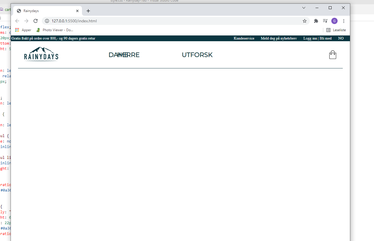
<title>Rainydays</title>

<link rel="stylesheet" href="css/style.css">
   <div class= "infobar">

        <nav class="Info1">

            <ul>

             <li><a href="#"><font color=#FFFFFF>Gratis frakt på ordre over 800,- og 90 dagers gratis retur</font></a></li>

            </ul>

        </nav>

        <nav class="Info2">

            <ul>

             <li><a href="#"><font color=#FFFFFF>Kundeservice</font></a></li>

             <li><a href="#"><font color=#FFFFFF>Meld deg på nyhetsbrev</font></a></li>

             <li><a href="#"><font color=#FFFFFF>Logg inn | Bli med</font></a></li>

             <li><a href="#"><font color=#FFFFFF>NO</font></a></li>

            </ul>

        </nav>

   </div>
    <div class="navbar">

       <div class="logo">

           <img src="images/kk.png" width="125px">

       </div>

       <nav class="Herre">

          <ul>

              <li><a href="#">HERRE</a></li>

          </ul>

       </nav>

       <nav class="Dame">

          <ul>

              <li><a href="#">DAME</a></li>

          </ul>

       </nav>

       <Nav class="Utforsk" >

          <ul>

              <li><a href="#">UTFORSK</a></li>

          </ul>

       </nav>

   </div>
I am about to head into lunch.
But the forum is pretty active right now, so other people will probably jump in and help.
But the HTML font tag is no longer used.
It was only used in HTML 4.
It is not support in HTML 5.
So that is probably why the font color isn’t changing.
You will need to remove those font tags and change the color in your css.
Hope that helps!
it did work, thats the problem when trying through css it dosent change, too the color i want, i just did it through html too see how it would look.
So I threw your code, into codepen and applied a class to the nav link and the color changed worked for me.
     <li><a class="nav-link" href="#">Gratis frakt på ordre over 800,- og 90 dagers gratis retur</a>
          </li>
.nav-link {
  color:red;
}

Maybe try adding a class to the link you want to change color
Thank you!! it worked now
How would you, make logo and text from each side come closer to the middel?
You can try playing around with justify-content
maybe try justify-content: center;
Or you can play around with the other options.

For smaller devices,like mobile phones most people would create a hamburger menu.
You can have all of your nav links inside the hamburger menu and then when the user clicks on the icon it opens up to all of the nav links.
Another option would be to use a media query to target smaller devices and have the flex direction be set to column instead of the default row.
But I think the better options is to create a hamburger menu since most users would be accustomed to that.
There are plenty of tutorials that will show you how to do that like this one