Tell us what’s happening:
I’ve been getting these two errors for the past 2 hours now:
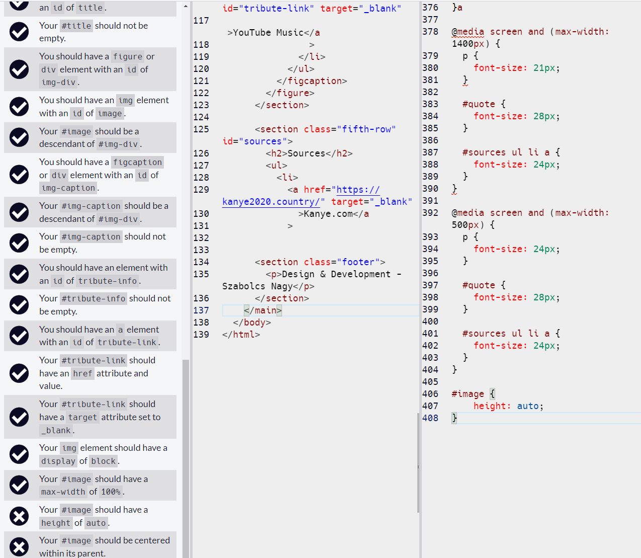
- Your
#imageshould have aheightofauto. - Failed:Your
#imageshould be centered within its parent.
I’m sure something is overwriting something I’ve now just lost it, GPT was no use here haha.
Your code so far
<!DOCTYPE html>

<html>
	<head>
		<link rel="stylesheet" href="styles.css" />
		<meta http-equiv="Page" content="text/html; charset=UTF-8" />
		<title>Tribute Page</title>
	</head>

	<body>
		<main id="main">
			<nav>
				<ul>
					<li>
						<a href="#home">Home</a>
					</li>
					<li>
						<a href="#tribute-info">Biography</a>
					</li>
					<li>
						<a href="#albums">Top Albums</a>
					</li>
					<li>
						<a href="#sources">Sources</a>
					</li>
				</ul>
			</nav>

			<section class="first-row" id="home">
				<div class="container">
					<div class="column-header">
						<h1 id="title">Kanye West</h1>

						<p id="sub-header">an American rapper</p>
						<div>
							<p>
Born in Atlanta and raised in Chicago,[5][6] West gained recognition as a producer
                                for Roc-A-Fella Records in the early 2000s, producing singles for several artists
                                and developing the "chipmunk soul" sampling style. Intent on pursuing a solo career
                                as a rapper, he released his debut studio album, The College Dropout (2004), to critical
                                and commercial success.
								graduated in 2011.
							</p>
						</div>
					</div>

					<div class="column-image">
						<div id="image-div">
							<img src="/img/Kanye.jpg" width="472" height="495" />
						</div>
					</div>
				</div>
			</section>

			<section class="second-row" id="tribute-info">
				<article>
					<h2>Biography</h2>
					<p>
						West was born on June 8, 1977, in Atlanta, Georgia.[b] After his parents divorced when he was three years old, he moved with his mother to Chicago, Illinois.[23][24] His father, Ray West, is a former Black Panther and was one of the first black photojournalists at The Atlanta Journal-Constitution. Ray later became a Christian counselor,[24] and in 2006, opened the Good Water Store and Café in Lexington Park, Maryland, with startup capital from his son.[25][26] West's mother, Donda C. West (née Williams),[27] was a professor of English at Clark Atlanta University and the Chair of the English Department at Chicago State University before retiring to serve as his manager.
					</p>
					<p>
						West began his early production career in the mid-1990s, creating beats primarily for burgeoning local artists around his area. His first official production credits came at nineteen when he produced eight tracks on Down to Earth, the 1996 debut album of a Chicago rapper, Grav.
					</p>
					<p></p>
					<p></p>
					<p></p>
					<p></p>
				</article>
			</section>

			<section class="third-row">
				<blockquote>
					<p id="quote">
						“I refuse to accept other people's ideas of happiness for me. As if there's a "one size fits all" standard for happiness”
					</p>
				</blockquote>
			</section>

			<!-- Gallery -->
			<section class="fourth-row" id="albums">
				<h2>Best Albums</h2>

				<figure class="img-container" id="img-div">
					<img
						class="project-image"
						id="image"
						src="img/dropout.jpg"
						alt="College Dropout"
					/>
					<figcaption class="caption" id="img-caption">
						<p class="name-caption">The College Dropout</p>
						<p class="date-caption">2004</p>
						<ul>
							<li>
								<a
									href="https://music.youtube.com/playlist?list=OLAK5uy_mDFKFAtmr5gFhZnDVfUFFgoYK9dpY4ml0"
									>YouTube Music</a>
							</li>
						</ul>
					</figcaption>
				</figure>

				<figure class="img-container">
					<img
						class="project-image"
						src="img/fatnasy.jpg"
						alt="My Beautiful Dark Twisted Fantasy"
					/>
					<figcaption class="caption">
						<p class="name-caption">My Beautiful Dark Twisted Fantasy</p>
						<p class="date-caption">2010</p>
						<ul>
							<li>
								<a
									href="https://music.youtube.com/playlist?list=OLAK5uy_lh6e__g89bgNq1BF7EM9GMlXMLzwvatgA"
									id="tribute-link" target="_blank"
                                    >YouTube Music</a
								>
							</li>
						</ul>
					</figcaption>
				</figure>
			</section>

			<section class="fifth-row" id="sources">
				<h2>Sources</h2>
				<ul>
					<li>
						<a href="https://kanye2020.country/" target="_blank"
							>Kanye.com</a
						>


			<section class="footer">
				<p>Design & Development - Szabolcs Nagy</p>
			</section>
		</main>
	</body>
</html>
* {
padding: 0;
margin: 0;
box-sizing: border-box;
overflow-x: hidden;
}
html {
font-size: 10px;
scroll-behavior: smooth;
}
body {
font-family: 'Lato', 'Segoe UI', 'Helvetica Neue', Arial, sans-serif;
font-size: 1.6rem;
line-height: 1.5;
margin: 0;
background-color: #f3ecea;
color: #37383a;
}
a:link {
text-decoration: none;
}
@media (min-width: 1400px) {
body {
font-size: 2.5rem;
line-height: 1.8;
}
}
h1 {
font-size: 6rem;
font-family: 'Libre Baskerville', serif;
font-weight: bold;
}
#sub-header {
font-weight: 300;
color: #9f9f9f;
text-transform: uppercase;
}
@media (max-width: 400px) {
h1 {
font-size: 4rem;
}
}
@media (min-width: 1400px) {
h1 {
font-size: 7rem;
}
}
h2 {
font-size: 3rem;
font-family: 'Libre Baskerville', serif;
text-align: center;
padding-bottom: 5rem;
}
@media (min-width: 1400px) {
h2 {
font-size: 4rem;
}
}
blockquote {
font-size: 2rem;
font-style: italic;
font-family: 'Libre Baskerville', serif;
text-align: center;
margin-bottom: 1rem;
}
@media (min-width: 1400px) {
blockquote {
font-size: 3rem;
}
}
nav {
background-color: #37383a;
width: 100%;
position: fixed;
display: flex;
align-items: center;
justify-content: center;
padding-top: 0.5rem;
padding-bottom: 0rem;
z-index: 8;
}
nav ul li {
list-style-type: none;
display: inline-block;
}
nav ul form {
display: inline-block;
}
nav ul li a {
color: #fbfaf8;
text-decoration: none;
font-size: 24px;
font-weight: bold;
padding: 10px 20px;
transition: 0.2s;
}
nav ul li a:hover {
transition: 0.3s;
color: bisque;
}
ul {
list-style: none;
padding-left: 0;
line-height: 2;
}
#tribute-link {
font-weight: 500;
color: #fefefe;
text-transform: uppercase;
line-height: 2;
}
#tribute-link:visited {
color: #fefefe;
}
#tribute-link:hover {
text-decoration: none;
}
#tribute-link-dash {
text-decoration: none;
}
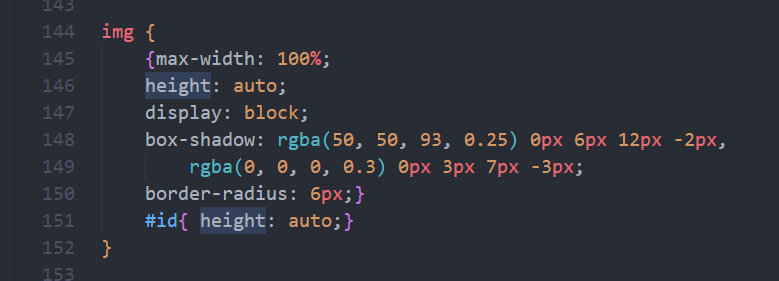
img {
max-width: 100%;
height: auto;
display: block;
box-shadow: rgba(50, 50, 93, 0.25) 0px 6px 12px -2px,
rgba(0, 0, 0, 0.3) 0px 3px 7px -3px;
border-radius: 6px;
}
figure img {
position: relative;
transition: 0.3s;
}
.caption p {
font-family: 'Courier New', Courier;
text-transform: uppercase;
}
.caption p {
font-family: 'Courier New', Courier;
text-transform: uppercase;
color: white;
font-size: 18px;
font-weight: bold;
}
.caption li a {
font-family: 'Courier New', Courier;
text-transform: uppercase;
color: white;
font-size: 16px;
}
.caption li {
line-height: 1.7rem;
}
.img-container {
object-fit: contain;
transition: 0.4s;
position: relative;
z-index: 0;
max-width: 100%;
max-height: 100%;
}
.img-container:hover > img {
transition: 0.4s;
opacity: 20%;
z-index: 0;
}
.img-container:hover > .caption {
z-index: 1;
transition: 0.4s;
}
.caption {
padding-top: 1.2rem;
font-family: 'Libre Baskerville', serif;
position: absolute;
top: 50%;
left: 50%;
transform: translate(-50%, -50%);
cursor: default;
z-index: -1;
}
.date-caption {
font-size: 1rem;
font-style: italic;
position: relative;
top: -1rem;
}
.name-caption {
font-size: 1.5rem;
font-weight: bold;
}
@media (min-width: 1400px) {
.date-caption {
font-size: 1.5rem;
}
.name-caption {
font-size: 2rem;
}
}
.column-header {
float: left;
width: 65%;
padding: 2.5%;
box-sizing: border-box;
}
.column-image {
float: left;
padding: 2.5%;
width: 35%;
box-sizing: border-box;
}
.container::after {
content: '';
display: table;
clear: both;
}
@media screen and (max-width: 1000px) {
.column-header,
.column-image {
width: 100%;
float: none;
}
#image-div img {
margin: auto;
}
}
.first-row {
padding: 12rem 5rem 5rem 5rem;
top: 0;
}
.second-row {
color: #37383a;
padding: 0 5rem 4rem 5rem;
margin-bottom: 5rem;
}
.third-row {
background-color: #37383a;
color: #fefefe;
padding: 5rem;
text-align: center;
}
.fourth-row {
margin-top: 10rem;
background-color: #333;
overflow: auto;
white-space: nowrap;
display: inline-block;
color: white;
text-align: center;
padding: 14px;
text-decoration: none;
padding-left: 3rem;
width: 100%;
}
.fourth-row h2 {
font-family: 'Lato', 'Segoe UI', 'Helvetica Neue', Arial, sans-serif;
position: absolute;
text-align: left;
margin-left: 5rem;
width: 100%;
}
.fourth-row figure {
margin-top: 10rem;
background-color: #333;
overflow: auto;
white-space: nowrap;
display: inline-block;
color: white;
text-align: center;
padding: 0rem 5rem 1rem 5rem;
text-decoration: none;
}
.fourth-row figure img {
object-fit: contain;
width: 390px;
height: 390px;
border-radius: 10px;
}
.fifth-row {
padding: 4rem;
text-align: center;
margin-bottom: 6rem;
}
.footer {
background-color: #37383a;
color: #fefefe;
padding: 0.2rem;
text-align: center;
}
#sources h2 {
font-family: 'Lato', 'Segoe UI', 'Helvetica Neue', Arial, sans-serif;
}
#sources ul li {
line-height: 3.6rem;
}
@media screen and (max-width: 600px) {
nav ul li a {
font-size: 19px;
}
p {
font-size: 18px;
}
#quote {
font-size: 24px;
}
#sources ul li a {
font-size: 18px;
}
}
@media screen and (max-width: 1000px) {
p {
font-size: 18px;
}
#quote {
font-size: 24px;
}
#sources ul li a {
font-size: 18px;
}
}
@media screen and (max-width: 1400px) {
p {
font-size: 21px;
}
#quote {
font-size: 28px;
}
#sources ul li a {
font-size: 24px;
}
}
@media screen and (max-width: 500px) {
p {
font-size: 24px;
}
#quote {
font-size: 28px;
}
#sources ul li a {
font-size: 24px;
}
}
Your browser information:
User Agent is: Mozilla/5.0 (Windows NT 10.0; Win64; x64) AppleWebKit/537.36 (KHTML, like Gecko) Chrome/113.0.0.0 Safari/537.36
Challenge: Tribute Page - Build a Tribute Page
Link to the challenge: