Hey. I’m working on my tribute page.
Here’s the link: https://codepen.io/sebastian-mayregger/full/zYwJvyb
Experimenting with vmin, grid and flexbox to make it look neat on my phone (P40 lite), but still looks like crap. I honestly don’t have much expertise on these apart from the challenges. Also unsure on which width to apply for the @media’s.
Any tips on how to make it responsive for big screens such as an TV and small ones?
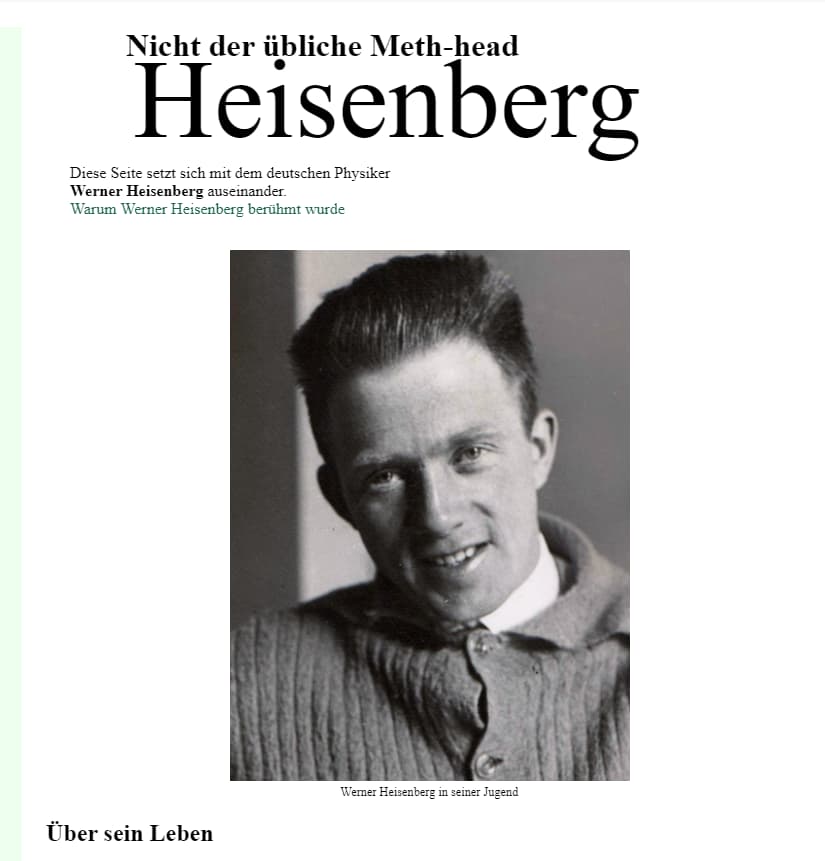
Looks like this on my screen
In general, use a narrow-first approach to styling. Narrow your browser as far in as it will go and make the page look good at that narrow width (no horizontal scroll bars). This will be your default CSS (don’t use any CSS break points).
After you have it looking good at the narrow width then you can gradually widen the browser and once you think you have enough horizontal space to rearrange things for a wider viewport then add your CSS break point (using min-width and preferably em units instead of px).
A page like this with a simple layout will not need much fixing for larger viewports. But definitely you will want to reduce the font size on “Heisenberg” at the top for narrow view and then you can make it a little bigger for wider view.