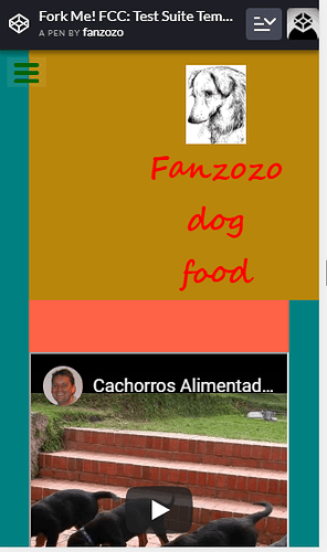
hello good people, i will like a feedback on my product landing page
your contribution is appreciated. https://codepen.io/fanzozo/pen/pMNXOE
Good job! I love the way button background transitions to a different color!
- Try moving cards side by side instead of stacking them up.
- Give some padding top to inside card body to give space.
Looks good. Couple observations:
- Does not look good on mobile (phone). The header takes up half of the viewport on a mobile phone.
2)I’m not sure if this is intentional but the header does not span the entire width of page on larger devices.
other than that, looks really good!
Thanks for your input channel you check it again, one thing seems not right but I don’t know what.https://codepen.io/fanzozo/pen/pMNXOE
Thanks can you please check for me it doesn’t pass. https://codepen.io/fanzozo/pen/pMNXOE
Looks better however, as the attached img below shows, i would try and center the nav bar. Also, i like the border-radius that you put on the background(s). I think it would look cool to have the same border-radius for the nav


