I made this page as the home for an hypothetical Course page, trying to make it responsive and using grids as a method to structure the page’s section, how could i improve it visually or in terms of structure so it’s suitable for any device’s screen?
Sorry there aren’t images i couldn’t find any suitable that wouldn’t damage the structure, i’ll share some pics so you could see how it looks with the images i use (and can’t link in the codepen).
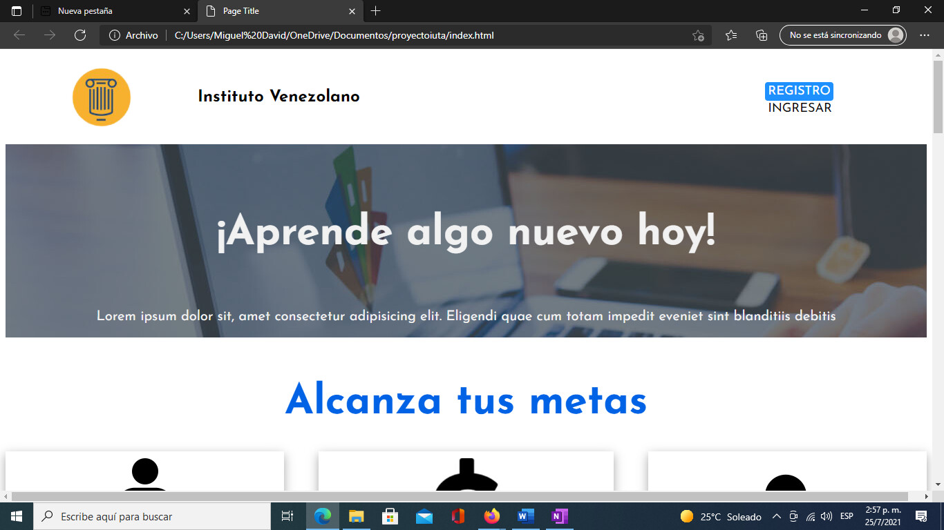


I hope this is allowed if it’s not i’m sorry. I would like to hear some feedback and how can i improve visually this page, maybe is too simplistic at the moment, maybe i could add some more stuff, thanks in advance!