it took me almost 3 days to complete my portfolio and the reason is that i made this portfolio for my personal and blog use too; not only for the challenge.In the future i am thinking about adding some more interesting UI .But for now this is it. #if you guys have any idea ,do share i’m sure gonna implement it to the page.
[Edited : fixed some size issues as pointed out in comment section]
Hey @RocktimSaikia,
very nice site design. I especially liked the hovering social icon buttons at the bottom.
I would try to improve the responsiveness of the site, as it currently displays well only on large screens.
Also the image with the alt text, a standing boy, did not load for me.
It looks really good. Here’s some of the feedback that I have:
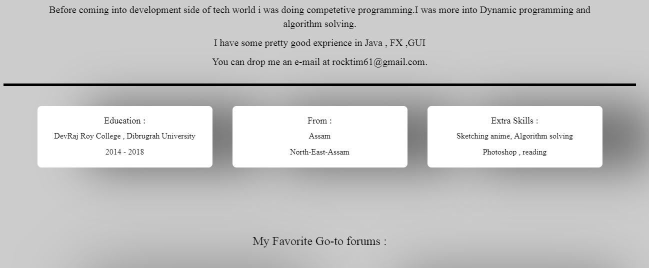
In the about me area, I would suggest making all 3 boxes the same size.
When I click portfolio, it doesn’t seem to do anything in the navigation bar.
The picture for Medium seems to be broken, at least from what I see.
Lastly, the cursive font is not the easiest to read. I would suggest to change it to another font.
I really like the social media icons on the page as well!
Hope that helps!
Thanks for the feedback i also noticed lately that images sometimes gets broke and the reason is probably when i linked the images in code i used an online Url shorten website to make the Urls short and simple. may be that’s why the page having some problem in loading the images.
and the boxes seems to same size i guess .
and yeah i also think the cursive font was not a good idea .
I’ll fix that