I have been stuck for a long while trying to get my Portfolio page going and I am pretty frustrated that I keep getting stuck on the same thing in Codepen. It makes the navigation bar vertical instead of horizontal.
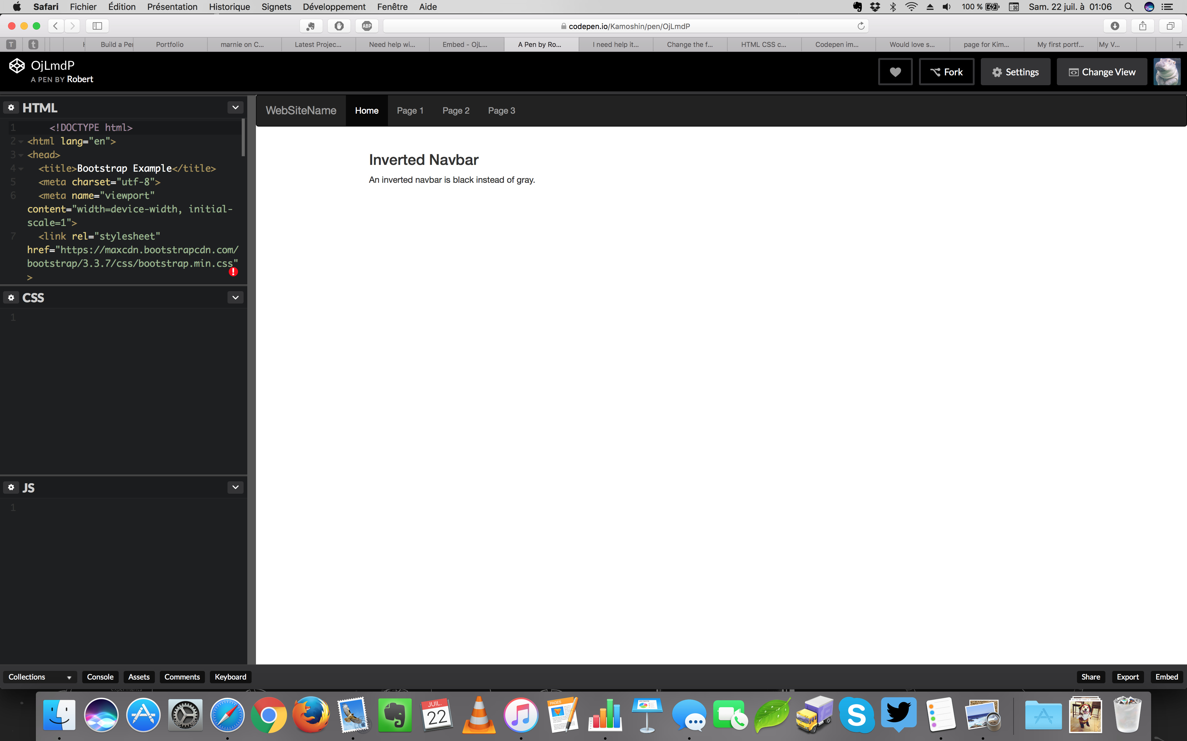
I’m trying to make a horizontal navigation bar and even copied some HTML from W3Schools to see what would happen. When I save the HTML in CodePen, this is what I get.
This is Bootstrap, through and through. You’ve set everything up correctly except for the collapsing part of your nav. If you added the <div class="collapse navbar-collapse" id="bs-example-navbar-collapse-1"> and closing tag around your ul, you’d find that your links would disappear.
This is because Bootstrap is trying to make the navigation “mobile-friendly”. If you open up the display window (by dragging the middle bar) or change the view to full page, you’ll see a horizontal nav.
Soooo, think we figured this out here. This had to do everythign with the responsive design and the fact that I had to make my “view” different. I didn’t realize that because of my monitor size/shape (small square), I would have to make the Viewing Area basically the entire monitor.