Im trying to get this text in a pic to center with float: center but it keeps going down bellow table, what am i doing wrong? Or is it a bug with notepad++ because its been pissing me off lately.
https://imgur.com/c8l04qV
Here’s my CSS:
https://imgur.com/bYyh5wa
How do i put a code here? What ever i try even with dots its not working?
<!doctype html>
<html lang="en">
<head>
<title>Some title</title>
<meta http-equiv="content-type" type="text/css">
<meta name="viewport" content="width:device-width, initial-scale=1.0">
<meta name="description" content="Some description">
<meta name="author" content="Ismar">
<meta name="generator" content="notepad++">
<meta nema="keywords" content="HTML, CSS, JavaScript, PHP">
<link rel="stylesheet" href="https://maxcdn.bootstrapcdn.com/bootstrap/4.0.0/css/bootstrap.min.css" integrity="sha384-Gn5384xqQ1aoWXA+058RXPxPg6fy4IWvTNh0E263XmFcJlSAwiGgFAW/dAiS6JXm" crossorigin="anonymous">
<link rel="stylesheet" type="text/css" href="New2.css">
</head>
<body>
<div class="container-fluid">
<h1 class="text-center">Hello world</h1>

<div id="box1">
<p>Pellentesque habitant morbi tristique senectus et netus et malesuada fames ac turpis egestas.<br>
 Vestibulum tortor quam, feugiat vitae, ultricies eget, tempor sit amet, ante. <br>
 Donec eu libero sit amet quam egestas semper. Aenean ultricies mi vitae est. Mauris placerat eleifend leo.</p>
</div>

<div id="box2">
<p>Pellentesque habitant morbi tristique senectus et netus et malesuada fames ac turpis egestas.<br>
 Vestibulum tortor quam, feugiat vitae, ultricies eget, tempor sit amet, ante. <br>
 Donec eu libero sit amet quam egestas semper. Aenean ultricies mi vitae est. Mauris placerat eleifend leo.</p>
</div>
<div id="box3">
<p>Pellentesque habitant morbi tristique senectus et netus et malesuada fames ac turpis egestas.<br>
 Vestibulum tortor quam, feugiat vitae, ultricies eget, tempor sit amet, ante. <br>
 Donec eu libero sit amet quam egestas semper. Aenean ultricies mi vitae est. Mauris placerat eleifend leo.</p>
</div>


<script src="https://code.jquery.com/jquery-3.2.1.slim.min.js" integrity="sha384-KJ3o2DKtIkvYIK3UENzmM7KCkRr/rE9/Qpg6aAZGJwFDMVNA/GpGFF93hXpG5KkN" crossorigin="anonymous"></script>
<script src="https://cdnjs.cloudflare.com/ajax/libs/popper.js/1.12.9/umd/popper.min.js" integrity="sha384-ApNbgh9B+Y1QKtv3Rn7W3mgPxhU9K/ScQsAP7hUibX39j7fakFPskvXusvfa0b4Q" crossorigin="anonymous"></script>
<script src="https://maxcdn.bootstrapcdn.com/bootstrap/4.0.0/js/bootstrap.min.js" integrity="sha384-JZR6Spejh4U02d8jOt6vLEHfe/JQGiRRSQQxSfFWpi1MquVdAyjUar5+76PVCmYl" crossorigin="anonymous"></script>
</div>
</body>
</html>
Thats my code and here’s my CSS:
table th {text-align:center; background-color: green; }
table td {border: solid 1px; padding: 4px 5px 4px 5px;}
	p {text-align: center;}
	#box1 {width: 300px; height: 300px; float: left;}
	#box2 {width: 300px; height: 300px; margin: 30px auto;}
	#box3 {width: 300px; height: 300px; float: right;}
Text on right always goes down on right no matter of what, what did i do wrong?

You shouldn’t be using floats for what you’re trying to accomplish here. There are much better ways to do this, and floats can easily create pains like this.
A basic solution for this is to use percentage-based widths. Get rid of the id’s for each element and just use a simple class for each giving them 1/3 of the width:
.box {
  width: 33%;
  height: 300px;
  display: inline-block;
}
This won’t give you the space inbetween however. Since you are using Bootstrap containers, the correct way to do this is using Bootstrap’s grid system. Ditch all of the CSS I gave above, and use Bootstrap rows and columns:
<div class="container-fluid">
<h1 class="text-center">Hello world</h1>
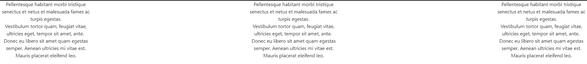
<div class="row">
<div class="col">
<p>Pellentesque habitant morbi tristique senectus et netus et malesuada fames ac turpis egestas.<br> Vestibulum tortor quam, feugiat vitae, ultricies eget, tempor sit amet, ante. <br> Donec eu libero sit amet quam egestas semper. Aenean ultricies mi
vitae est. Mauris placerat eleifend leo.</p>
</div>
</div>
</div>
Now, let me show you how to do this without Bootstrap and without percentage based widths. This will be a solution more flexible like floats, but better. This is called flexbox, and it is what Bootstrap 4 uses under the hood. This will let you easily create smooth layouts like you want without messing with percentages and having floats move around. I’m going to get rid of the Bootstrap so we can do this with pure HTML and CSS:
<div class="flex-container">
  <div class="box">
    <p>Pellentesque habitant morbi tristique senectus et netus et malesuada fames ac turpis egestas.<br> Vestibulum tortor quam, feugiat vitae, ultricies eget, tempor sit amet, ante. <br> Donec eu libero sit amet quam egestas semper. Aenean ultricies mi
      vitae est. Mauris placerat eleifend leo.</p>
  </div>
</div>
.flex-container {
  display: flex;
  justify-content: space-between;
}

.box {
  width: 300px;
}
This will give you exactly what you want.
I suggest reading more about flexbox as it will be much more useful for you than floats. Here is an article to get started with:
I would also suggest reading on how to use Bootstrap 4 rows and columns correctly, since you are using Bootstrap you should probably be doing that approach.
And finally, for your code, put your script tags at the end of the body not at the end of your container-fluid.
I hope this helps, give it a try, and see if you can get it to work.
Here is a demo you can play with: CodePen demo
1 Like
Thank you alot for you help, i fixed my prob by using div class row over the existing boxes, i will practice the code you gave me above too. Positioning elements sure is tricky.
1 Like
It is at first, but once you build enough websites, it is a lot easier. Learning flexbox and grids will be your best friend.