I got so familiar using Bootstrap, I really struggled when trying to use flexbox. Finally figured it out though. If there is a way to dynamically scale the images using flexbox, similar to Bootstrap, please let me know. I used media queries and although the result is okay, there is a lot negative space between the content I'd like to eliminate if possible. Good or bad, please let me know what you think. Here is the link: wXMWMg
Looks very neat and I like the color scheme and theme so much.
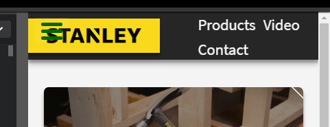
I also would name it debug shop rather hammer(if you know what I mean)
Good parts:
- Nice color scheme, and good contrast for bg and fg.
- Good spacing between element. very good.
- alt attribute is set for images, very good.
Parts need fix:
- It’s broken for mobile devices! Mostly becasue you have some constant absolute sized elements in your page like the embed video.
- Try to use relative units over absolute units.
- font size could be a little larger(not critical)
Overall looks okay, if you could fix the mobile it will aweosme!
Keep going on great work, happy programming
Thank you for reviewing and providing some great suggestions. I updated the CSS to use relative units where I could, and adjusted the media queries. Video scaling is no longer an issue. It should now be mobile friendly for most devices. Take a second look when you get a chance and let me know what you think.
Perfect, now looks much better.
You may also fix the links at the header for mobile too, check
This is not very friendly and out of standards for mobile view.
Common way are hiding them out and provide accessing them using a menu(patty like) .
Keep going on great work and fix this issue too, you can!
Happy programming
The colour scheme is perfect, and also the font family. Looks great!
I would add some text to the header image. I suspect someone visiting your site might be confused at first. Something short like “Home for home tooling”, or anything that indicates what the company is about, it’s values, etc.
Also, “video” feels a bit too general (in the top navbar). I would probably call it “about” or something a bit more specific.
Thanks again for your additional suggestions. I updated the navbar to include a collapsible hamburger menu making it mobile friendly. It took me a while to figure out how to customize the CSS, because I had to override the Bootstrap native styling. In addition, I also increased the font size so everything is easier to read
Looks better now, very good!
Just some very minor issues! when screen is small, at the top, content goes under the nav bar, also navbar gets double height becasue menu icon goes down, check

I also noticed you applied some whitespace in email placeholder to make it center text, so please don’t, please.
Remove The space before the placeholder, if you like to make it center, use css to make it center.
Everything else looks good, well done!
keep going on good work, happy programming
Thank you for reviewing and your suggestions. You were absolutely correct on the ‘video’ nav link, it was definitely too generic. I changed it to, ‘About.’ I’ll see about adding some descriptive text in the header. It didn’t occur to me at first because Stanley is one of the largest and most recognized hand tool manufacturers in the U.S. As far as including it in the design, where would you recommend putting it?
1 Like
Yeah, I hear you on the placeholder text. I thought it was kind of lame that had to add whitespace. My concern was that I didn’t want the actual input text to be centered. I’ll see if I can target just the placeholder element, it never occured to me that you could do that. Also, as far as the mobile scaling… The issue you stated only occurs at screen width < 330px. I don’t know any mobile devices that have screens that small. I suppose it could occur if they had their browser really zoomed in, but I think the likelihood of this scenario is not that high.
Easy dude, use some hand of js. by default set the text-align center(so placeholder is center) when there is no value entered(empty), When user starts entering data(on focus), you set the text-align of the textbox left. Also when user finished editing(on blur), then check again if textfield is empty, so center align, otherwise left. (EASY!)
No dude, but this is very rare, but this is possible a 512px width screen comes with zoomed page, so it will face with the same issue even it has kind of wide screen. but this is not very critical.
1 Like
You are an amazing reviewer. So grateful to have your input on my projects. I’ll see if I can figure out the .js , although it may take me a while considering I’m still a noob. Even If I cannot figure it out now, I’ll come back after I take the Javascript lessons and update. Thanks again for all your help.