I am very happy to have finished my Responsive Web Design - Personal Portfolio Webpage project after a long time. I would be very happy to receive your feedbacks and I am open to suggestions for improvement.
I couldn’t review your portfolio (sorry I haven’t much time LOL) but I did want to point out that your design is great but the GitHub link in the contact section has a twitter label, just so you can know.
Add transparent bottom borders to the nav links and then just add the color on hover. That way you do not get the little jump that happens now.
The images are much too big (the resolution). In fact, it is causing some lag on scroll in Chrome because of the size combined with background-attachment: fixed. Not sure why Chrome chokes on it but Firefox doesn’t. It has been an issue for a long time with Chrome. Still, no need for the images to be so big as it also affects load performance.
I would suggest you add resize: vertical to the textarea so it can’t be pulled wider by the user.
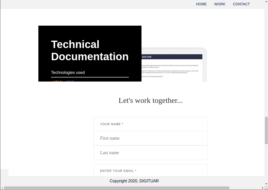
The page isn’t really responsive. On small screen sizes, you have an overflow and the project images get covered up by the project info text. The last box for the Technical Documentation info text is also cutting off the view button. I would give the “mobile” design a little more love.
When you think about design, you should mostly think about the visitor and how you want to lead them to some actions. So when we have a look at this screenshot:
What drives the attention? Everything is black and white, but there are (at least for me) the yellow and the blue icon. Is this the most important part of this screenshot? In general you want to use visual contrast to highlight a very important thing that should grab the visitor’s attention.
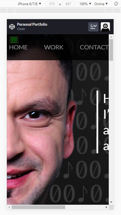
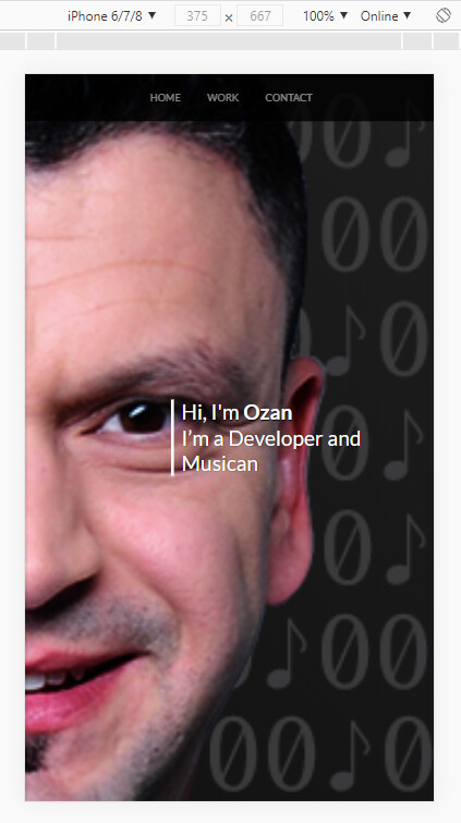
For example when you have a look at my small homepage, I think you can see what I want the visitor to click on:
The whole site is black and white, but then there are the yellow things sprinkled in (links, emoji, button). My links at the bottom are not very well distributed, but I’m okay with that. Just to give you a small example.
Thanks @lasjorg , you are right. I’ve changed a few things and tried to take your recommendations into account.
However, I did not fully understand the third point.
I also have the following problem. When I resize/reduce the window, the Technical Documentation project is always cut off. I didn’t get it.
Can you recommend something to me?
thank you for your advice. I can’t say that I’m a good designer. I’ve never been.
That’s why it’s all the more important to me to hear and collect ideas about it.
Maybe briefly about my opinion.
It is a list of the projects I have already created. That’s why all of this under Projects. It is important for me to show which technologies were used here. Exactly therefore the yellow and the blue. If the visitor is interested and wants to see details, he has the option of clicking on the view button and looking at the whole thing at codepen.io.
If I had a lot of text, like on your site, and if I had wanted to make the visitor notice something, it would be more useful to bring more contrast into it.
With as little input as on this page, I didn’t think that’s necessary. Maybe I’m wrong too. Please correct me.
Where would you have used more contrast on this side?
I would suggest you try reversing the problem here. How would you have created the design if it had to work on small screens first and then desktop?
You do not have to do mobile-first code (so min-width breakpoints) but you should think about the mobile design way before you have finished the desktop version. Because otherwise you just “paint” yourself into a corner you now have to get out of.
It’s perfectly fine having a much simpler design for the mobile, just as long as it works and does not cause issues with overflow, etc. It does not have to be a small version of the desktop design.
In the media area in my stylesheet, instead of display: flex, I used display: block. Then it doesn’t overlap anymore. Do you have a better idea or anyone else?In the media area in my stylesheet, instead of display: flex, I used display: block. Then it doesn’t overlap anymore
I might completely forgo the desktop design on mobile and just have a simple stacked layout where you have the project info above or below the project image. Just super simple, but still giving the user all the information they need.
I don’t think I would try making the desktop design work on mobile because it likely just doesn’t work on small screens.
Super neat concept with how the screens fill as you scroll, I love it, really nice work.
One honest critique is that I think it’s very difficult to achieve that half-face effect like in your first portfolio. You need great photography and lighting. I don’t think the effect is pulled off. What makes it work in the tribute photo is also the fact that the half face fades to black nicely, whereas your photo has the white glow from cropping. If the portfolio is going to prospective employers I think I would do something different with the photo myself, just my perspective on it.
For survey form, one thing is that I’m a big believer in “Full Name” as one field rather than two fields for first/last, unless there’s a compelling reason to have both. You can google the debate and see some UX articles on it.
I like the code background, but one thing struck me when I read you’re a music and code guy, might look neat to do something with a mix of code and musical notes, substituting the 1s for notes? Maybe not for this project just an idea, I’m sure someone’s done it somewhere else before, but I quickly threw together a background for fun:
thank you for your tips and comments. And thanks for the background image. I implemented it and hope you are OK with it.
You’re basically right based on the picture, but I’m not looking for a job. I already work in the industry. So for me it was more of a gimmick and I like the half-face effect.
I have completely revised the site again with regard to the responsive design. I would be happy if you could have a look at it again. Can I finish the project like this?
Is it still at the same link you originally gave us? If so then it has some responsiveness issues when I narrow my browser in. I’m getting a big horizontal scroll bar.


