I’ve just completed the technical documentation page. I’ve tried to make it responsive on smaller screens. I really need some feedback on it i.e. if I’m on the right track. Honest and straightforward reviews would be appreciated.
Here’s my pen https://codepen.io/strugglerz/pen/ExwKKNW
Your page looks good @struggler. Some things to revisit;
- Run your HTML code through the W3C validator.
- There is a HTML syntax/coding error you should be aware of and address.
Since copy/paste from codepen you can ignore the first warning and first two errors.
- There is a HTML syntax/coding error you should be aware of and address.
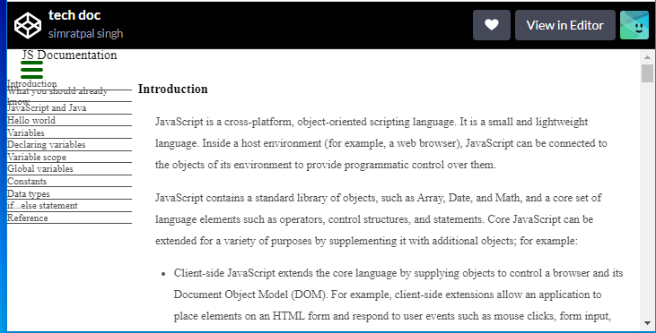
- The user story says “On regular sized devices (laptops, desktops), the element with
id="navbar"should be shown on the left side of the screen…”
on smaller screens it would be better to move the navbar to the top so the nav and info are not too small for the user
@Roma thank you for the feedback. I’ll take this into account and make adjustments
Hi! It looks pretty good. Take a look at how your page moves when you reduce the height - namely, your navigation menu on the left. I would recommend making each space a fixed height (or at least, not responsive to the viewport height) so that they don’t get scrunched up like that to where they eventually go over their border lines, if that makes sense.
Edit: Also, on my screen (which I believe is a little zoomed in compared to normal screen resolutions), your JS Documentation title above the nav is cut off in the upper left corner of the text.
In addition, I just noticed that your nav menu text starts right where the screen starts. You should put a little bit of padding so that it has some room to breathe 

@RiscloverYT Thanks for the review. I think i’ve given some padding to the menu as well as the menu title. Your screen surely is zoomed in  because i just double checked it, it’s there.
The suggestion for fixing the height of menu buttons is undoubtedly a good one. I will implement it. Thanks
I knew my screen was zoomed in! I’m on a regular TV monitor because my laptop screen broke, haha. It sucks because when I’m working on these projects, my view of my finished project is often different from others’ views, so I have trouble with figuring out my proportions sometimes.
Well, still. If you’re looking to make your page fully responsive (or at least moreso), that’s something you might consider as well But glad to help regardless!
@RiscloverYT hehe no problem. i will surely consider your suggestions.