…but learnt so much about CSS:
 FCC Project: Product Landing Page (codepen.io)
Multi-device support is such a pain…
…but learnt so much about CSS:
FCC Project: Product Landing Page (codepen.io)
Multi-device support is such a pain…
Hi, I fully agree that it takes an enormeous amount of time, to finally come to something which is still very basic in the end. I had the same feeling while making My artwork pictures page. Would be happy to get feedback (please review ;-)). But I liked spending the time to look things up and try out. I hope that’s the same for you, because I think that’s the main condition to go on and succeed. Besides that, good font choise for your page. It’s alsoclear that you wanted to harmonize your background color with the logo color. Also that, the choise of the right colors, I experienced as challenging. I used Palleton a lot, together with a color picking tool. Maybe another hint: using Bootstrap makes live easier when you get a bit familiar with it. You could use it for turning the three buttons in your navigation bar into a hamburger menu for small devices.
Best regards,
Luc
Your page looks good @gaac510. Some things to revisit;
body element in the HTML editor. (No need to include the body tags). For anything you want to add to the <head> element click on the ‘Settings’ button, then HTML and add it into the ‘Stuff for <head>’ box.
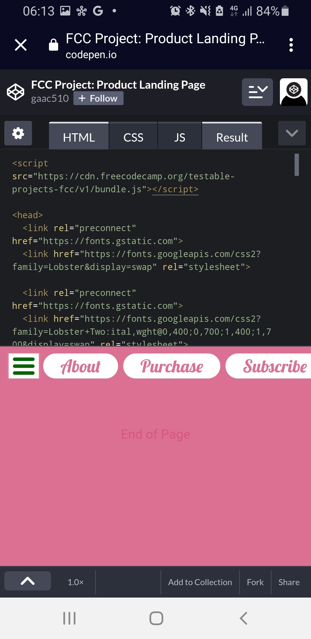
Your page is odd to me in that on small screens it takes up the entire width of the screen but on wider screens there is a lot of white space (literally) on the sides. Why doesn’t the page full expand width wise?
There is also a lot of dead space at the bottom of the page.
To help with responsiveness, start with the narrow view (mobile) design first and then work your way wider, adding breakpoints where needed for the wider design.
Thanks!
You page looks much better than mine
I’m about to learn bootstrap and may come back and update my landing page later.
Wow. Thank you so much for the detailed feedback!
Will try out the functions you mentioned later. They seem very helpful.
Will add in email validation. (HTML5 be praised!)
The white space in wider viewports is intended, similar to how freecodecamp curriculum pages behave, and partly for conditional at-rule practice.
The dead space is, or was, also intended. In the beginning I put it there to see how same page links behave.
I don’t have a background in design and I know from a design and utility point of view my page is pretty shit (dat scroll bar looks ugly as hell; will change to padding instead of margin the space  ). That’s why I used joke content not real life scenario
Really like your page. Design is good and clean. Only reviewed on mobile so not sure how it responds on larger screens but couple things I picked up. Your nav bar is off center and going off screen. Quick look at your css seems you put left padding in a before statement for some reason. You should use flexbox to center your items.
Also not sure if its something you forgot to add or delete but you have a footer with a useless p tag.
Thank you ! 
I’ve removed the p tag. Will probably fix the sizing issue later.
This topic was automatically closed 182 days after the last reply. New replies are no longer allowed.