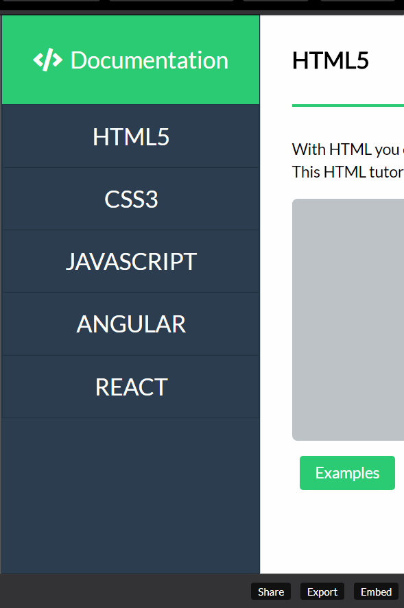
Hi guys need feedback on responsive web design’s technical documentation page https://codepen.io/mav1283/full/wXGLPW/
i can’t seem to fix the issue of the sidebar header and main content collapsing on mobile screen, i’v used flexbox on it and set it to flex-direction column for smaller screens but it isn’t working.
3 Likes
The colour scheme is really good, neat and simple. really good.
But the layout is broken! even in tabs and small screens, this is not good!
Look what I got from mobile:
Same, for the tabs and even desktops, the code sections breaks the layout, check:
Too much padding at the left!, content goes off the page! please fix.
Also there is no scrollbar, this is so bad!
I like the hover animation over the left links, cool. They come with a simple icon too, very good. I suggest you may make the animation a little faster.
Suggesions:
allow the user hide/show the left navigation panel using a button for instance. The space could be used for reading panel too.
This could be great if you could keep the left link active, when users is reading the related data. for example as a user is reading CSS section, you keep the CSS link at the left active, same when it scrolls to next section, next links gets activated then.
Keep going on great work, happy programming
1 Like
@NULL_dev
Hey thanks for the feedback, i’ll figure out the responsiveness of the columns and will take your suggestions 
I love the animations! How did you do the sliding effect when navigating between sections? Is there a tutorial for this kind of thing? I’m curious but from your code alone I couldn’t figure it out.
1 Like
Hey how are you? yes there’s tons of tutorials on youtube and google:
- I am using fontawesome (click the link), for the icons, you can add it in your code if you click the gear icon of CSS in codepen then just paste the cdn link of fontawesome.
- I wrap it in a
<span> tag that i set it’s width and opacity to zero by default, then when i hover it i set the values of the width and opacity to auto and 1.
- I just use css transitions for smooth sliding, something like this transition: 0.6s ease-in-out;
Hope it helps let me know if you need more guide how to do it.
1 Like
Thank you! What about when clicking on the navigation links, It makes the whole text slide up or down until it reaches the selected header…
That’s actually part of the FCC test, using target links… Each section has an id that is the value of the href in your navigation tag.
Example this nav link <a href="#home">Home</a> pairs with <section id="home"></section> i just added the pure css for smooth scroll, it’s faster than js but the side effect is no scrollbars, might want to edit it once i finish the course… Where you at now?
Yes, I got that part done, I want to figure out how to make that smooth scroll, I think it looks much better that way! Hmm I wonder if there’s a way to keep the scrollbars. Gonna search a bit more but it seems like pretty advanced ninja stuff to me hahah
This is how mine’s looking right now: https://codepen.io/Tubbie/full/gKKVmB Still need to make it responsive.
1 Like
Cool, this code removes the scrollbars:
::-webkit-scrollbar {
    width: 0px;  /* remove scrollbar space */
    display: none;
}
I set the overflow: hidden on the wrapper, and overflow-y: auto on the #main-doc that holds the sections, it’s messed up, what i would like to achieve is only the section is scrollable without scrollbars but not the entire wrapper. If i remove the code above, i get double scrollbars, one for the wrapper and the main section… Still using css transitions for smooth scrolling.
1 Like
I had no idea the scroll-behavior property existed!
I made it work on mine like this:
#main-doc {
overflow: scroll;
scroll-behavior: smooth;
height: 100vh;
}
1 Like
Nice! here’s some cool hover trick using pseudo elements, less semantic on html and more on css: https://www.youtube.com/watch?v=iia6QO-p4D8&t=320s
1 Like
Hi,
you did really great job. I’m trying to figure out how you fixed navbar without position: fixed property.
Could you please give me a hint?
Thanks
@MarekMac Hey thanks for the feedback, i didn’t fixed the position of the navbar, the main wrapper is set to flexbox and and wraps at a certain media query width. The nav and main containers are the only children of the wrapper.
here’s the master layout:
<div id="wrapper">
    <nav id="navbar">
      <header>
        <h1>Logo Here</h1>
      </header>
      <div class="navlinks">
        <a href="">link 1</a>
        <a href="">link 2</a>
      </div>
    </nav>
    <main id="main-doc">
      <section id="sect1">section 1</section>
      <section id="sect2">section 2</section>
    </main>
  </div>
O yeah, so simple yet great way to do it I used fixed positions already, buy I’ll remember your code for further projects.
Thank you mav
1 Like