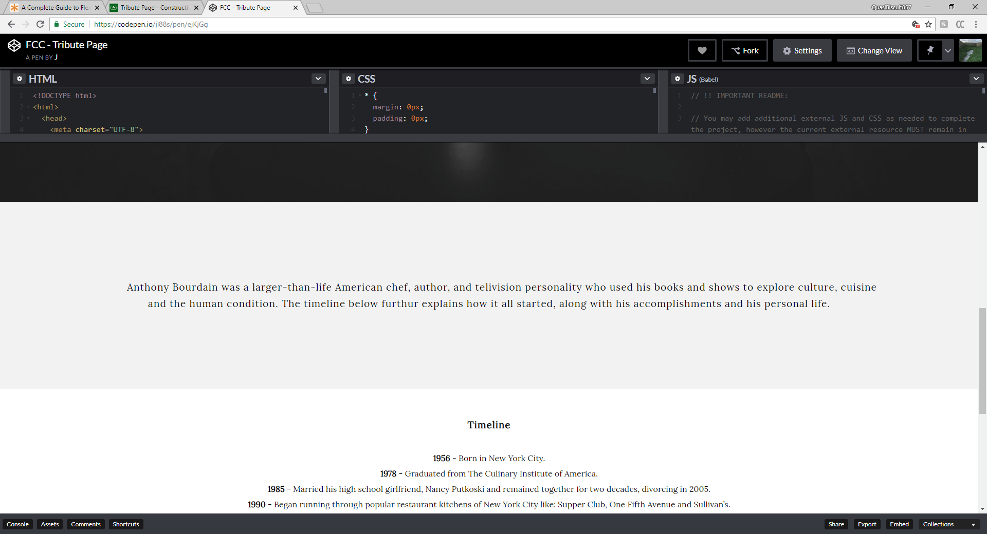
Hello, first time posting here! Attached is my FCC Tribute project and I am looking for any feedback (good or bad), thanks!
The improvements I can think of is to have the page more responsive when you minimize it to a tablet or phone size. I realized that the title, quote, and the description didn’t align properly when the page would get smaller, the text would just get lost in the other text and this is very frustrating.
As per codepen setup, in the HTML section you only have put the body parts (I.e. everything within the body tag, but without the tag itself). The head section should then be put into the pen settings.
As mentioned by you correctly, the responsiveness needs some improvements. I would start looking into media queries and start with a small layout, I.e. for mobile devices. Eventually change to some relative positioning. Probably the easiest to start with would be the padding on the img-caption, which squeezes the text quite strongly on a small device.
Your div#img-caption has too much padding when on mobile. A padding of 180px left and right will eat you 360px from your display width. I would add a media query to lower that values when on mobile.
You should also consider to reduce the font size from 25px to something lower.
Thank you for your comment, that’s very nice of you! One thing that helped me structure everything together, was by grabbing ideas from different sites and just piecing everything together. Tbh, I went through 2 other renderings before this final one. Inspire yourself with other’s work and you will be proud of your work in no time!
I went ahead and finally learned (briefly) how to use the Media Query on CSS. When the page is viewed in mobile (less than 600px), the texts, title, date, and tribute info is now fitted well.
Purely a design suggestion/option: on the timeline, making a break between the year and event in lieu of the dash; it makes it visually more consistent on smaller screens and the year acts like a subheader. Then adding margins between li items so that it reads well. But this is purely one design choice and what’s here is truly good.