I am working on a react project for a fitness app and struggling with design ideas.
Here you can see 2 different workout cards.
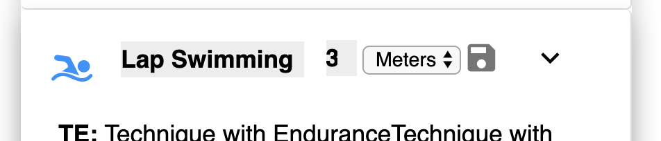
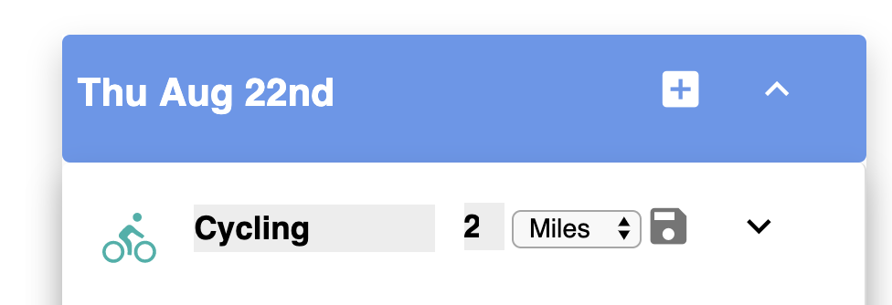
There is a date header (blue background), the a workout header which shows the activity, distance (or duration) and some editing icons (save/edit/show). This part looks OK to me.
My issue is when I go to edit them. I’m trying to emulate another site that edits each item in place, with no shifting of the elements around when you click into the edit field. Yet at the same time I want to create a concise display.
Maybe I need to do this a totally different way. I’m using grid to place the elements and am overriding default input styles to get the gray background for editing.
Another issue is for the swimming workout. “Lap Swimming” takes up 2 lines in show mode, but only 1 line in edit mode. I don’t like the visual jumping around.
Any suggestions or ideas.
Cycling workout, show mode

Cycling workout edit mode
Swimming workout show mode

Swimming workout edit mode