hi, I started a training project and I think it’s easy but it is not, here are my problems:
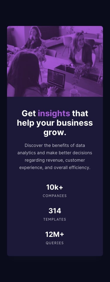
I want to make this card like it’s in the photo below the code
1-how to make it completely responsive for 375px mobiles.
2-they give me another Raw photo just like the one in the photo and I don’t know how to assign that other one to my code for mobile 375px
3-Has my code worked well so far? Please tell me what the mistakes are
4-those tree numbers below the paragraph how to do that(in designs below)
<!DOCTYPE html>

<html lang="en">

<head>

  <meta charset="UTF-8">

  <meta name="viewport" content="width=device-width, initial-scale=1.0"> <!-- displays site properly based on user's device -->

  <link rel="icon" type="image/png" sizes="32x32" href="./images/favicon-32x32.png">

  <link rel="stylesheet" href="https://fonts.google.com/specimen/Lexend+Deca">

  <link rel="stylesheet" href="https://fonts.google.com/specimen/Inter">


  <title>Frontend Mentor | Stats preview card component</title>

  <!-- Feel free to remove these styles or customize in your own stylesheet 👍 -->

<style>

  body {

    background: hsl(233, 47%, 7%);

  }

  #container {

    border-radius: 5px 0 0 5px;

    width: 80vw;

    display: flex;

    flex-direction: row;

    justify-content: space-between;

    margin: 100px auto;

  }

  .card-content {

    background:hsl(244, 38%, 16%);

    width: 50vw;

    border-radius: 5px 0 0 5px;

    display: flex;

    flex-direction: column;

    justify-content: center;

    align-items: center;

  }

   h2 {

    color: hsl(0, 0%, 100%);

    font-family: Inter;

    font-size: 35px;

    text-align: justify;

    margin: -50px 60px 0 0;

    font-weight: 700;

  }

   h2 span {

    color:  hsl(277, 64%, 61%);

  }

 .card-content p {

    margin: 40px 0 0 -120px;

    font-size: 15px;

    color: hsla(0, 0%, 100%, 0.75);

    text-align: justify;

  }

  img {

    width: 500px;

    filter: grayscale(100%) brightness(40%) sepia(100%) hue-rotate(-135deg) saturate(600%) contrast(0.8);

    border-radius: 0 5px 5px 0;

  }

  .img-responsive {

    max-width: 100%;

    height: auto;

  }

   strong{

    font-size: 25px;

    color: hsl(0, 0%, 100%);

  }

</style>

</head>

<body>

  <div id="container">

    <div class="card-content">

    <h2>Get <span>insights</span> that help<br> your business grow.</h2>

      <p>Discoverer the benefits of data analytics and make <br>

        better decisions regarding revenue, costumer <br>

        experience, and overall efficiency</p>

      <div class="state">

          <p><strong>10K+</strong>COMPANIES

          <strong>314</strong> TEMPLATES

          <strong>12M+</strong> QUERIES</p>

      </div>

      </div>

        <img class="img-responsive"  src="images/image-header-desktop.jpg" alt="people speaking">

  </div>


</body>

</html>
these are the designs I have to create :
desktop;

mobile;
 I’m just letting you know that calling it an emergency can make it come off as “needy” which might make people less likely to want to help. Ask for help, but do it as politely as possible. Ask for help with specific issues and do not just say “help me finish this”.