I am not going to complete it as I want to make changes to the design to fit a website for a local korean restaurant where I live. My brother in law’s grandmothers owns the restaurant.
There is the pen of what I completed. I just think if I continue it is going to be more confusing for when I start to make changes. Which, I am not the best when it comes to design if I have nothing to follow.
Obviously, I do not want to steal this design. To be honest, I doubt I will keep the over lapping images but I like the idea of the homepage. Point out some of the highlights and then show some of the more popular food that is ordered.
I know this is kind of a difficult question to answer, but I am up for suggestions on how you would change this design? I have looked at a few different restaurant websites today, but nothing that really jumped out at me.
I would design it from the ground up with mobile in mind. People may be on the road looking for a quick place to eat and access the website via google maps. Overlapping images and complicated graphics will be a mess to fit to all screen sizes. Try to go with a very simplistic approach.
Add some animations to your hover button (transition: 0.3s ease-in-out).
I would also pick a different font using google fonts.
I am not a fan of these types of websites. Of course every restaurant is going to say they have locally sourced fresh food that is good for the family. Unless you make a entire section of the page including real examples of fresh food (etc. got x meat from x botcher, here is their story), then its just the equivalent of a stock image but for text.
The front page of a restaurant shouldn’t be one button for the menu and 3 sections about the restaurant. It should be 1 button to go to navigate to another part of the website about the restaurant and 3 sections about the menu.
If you are going to have a section advertising, use consumer reviews and any rewards (best restaurant of 2019, etc) the restaurant has. I have seen plenty of well designed websites, filled with good pictures of food and short phrases about freshness, just for the reviews on google maps to be all 2 stars. Most people will be finding this website through google maps or some other service, so consumer reviews will provide the best truth for other consumers.
As a consumer, the most frustrating thing is when websites make you click through multiple portals to access the menu, because they are too busy advertising why they are the best. Then you get to the menu user interface and it’s broken, terrible to navigate and confusing. Focus your time on the menu user interface.
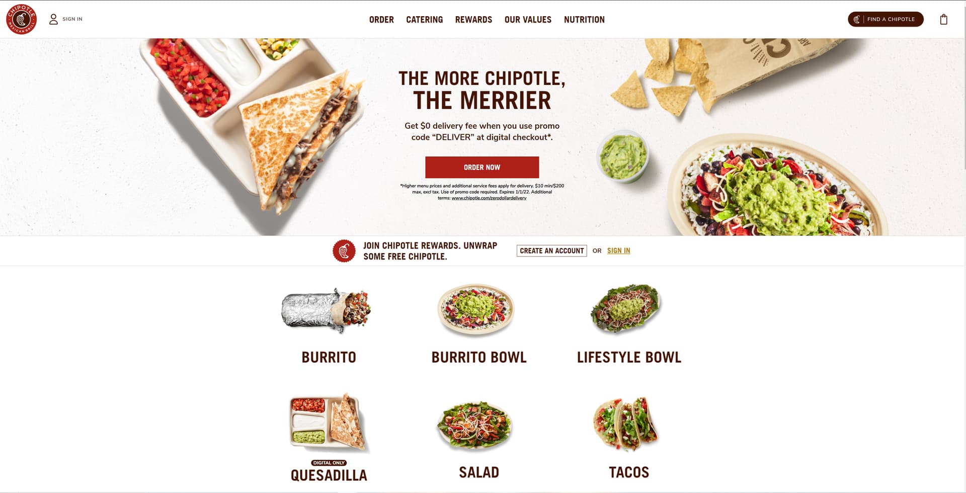
Most consumers would rather jump straight to the menu and see pictures of food. It is eye catching and pulls users in. Here is Chipotle’s website, it is eye catching to the point where no advertisement is needed. The website is simple and jumps straight to looking at the food with nothing extra. It works well on all browsers because all of the images are the same aspect ratio.
I didnt think about that. People go to a restaurant website to get food, and not a history lesson about the restaurant. That makes sense.
The text/ images that is in the code pen now is from the challenge. I will getting all images, and advertisements from the actual restaurant. Thats the thing for me though, I dont have that creative design eye. I was thinking about keeping the images floating when it comes to a desktop, and then stacking when it comes to mobile. Probably will not keep the images overlapping.
My brother in law also made the comment of having a color scheme with the colors of the korean flag. Not sure how that would look though.
The way I fixed this is by bring everything closer together with flexbox and made sure they are aligned in the center. Having the text on one side and image on the other may be trendy, but can be a mess for the user to look at.
I like the stock website that you are basing this on. It has a nice color scheme and the simplistic style looks very nice. I would follow the color scheme of alternating colors between sections, but swap out the sections for just different parts of the menu. That black white contrast is what makes the webpage pop, so I would not go with the Korean flag. Maybe take a picture of him with the Korean flag and put it in a “about us” section at the bottom of the page somewhere.
However, if you think about it, it only shows the user three menu items with two repetitive sections to book a table. I would say it is functionally useless, but the challenge restricted the programmer to only two pages so functionality is the best they could do.
Here is my idea, following along with the stock website.
Section 0: The main banner like you have. Make the sections flush to the edges of the screen (remove the white margin). Include a button to jump straight to the footer to Footer/ reservation section. Put the contact information, address and hours in the main banner overlay (not on the image itself, but on the overlay) instead of in the footer. This makes it easier for the user to find.
Section 1: Here is a look at our sushi. You could show the top 5 best looking sushi rolls (with descriptions besides them + specs), and then have a button at the bottom of the section to go to separate webpage that shows a complete view of all the sushi rolls you offer. Just like chipotle shows all the categories, and clicking on the categories takes you to other webpages for more information. Make sure you have a back button though.
Section 2: Here is a look at our main courses. Repeat the same idea above. Then deserts, etc.
Section 1 would be white, section 2 would be black, etc, following along with the theme of contrast (as with the stock website).
Maybe after this add a small “about us” section. Nothing too big, 1 or 2 pictures at most
Well, I wont be able to do the reservations. The restaurant this is going to be for is family run. So, they don’t have the technology the bigger chains do. Despite being one of the most popular places to eat in the downtown area here. Covid had done its damage, so this will be more of a website where they can look at the menu before they call to order.
As someone who studied design I would like to give some advice how to pimp up the visuals. It is important to use the right font family, this is often underrated, but actually something which can change the whole athmosphere of the website. Try to find a font for the headline and one for the text which make a good match. If you are lucky you can find a font on google fonts, but if you are ok to buy a font you do much better. Here you can search for top quality fonts: www.myfonts.com
Also super important is to choose the right colors. I think for a Korean restaurant a very dark anthrazit color together with white (high contrast) and one identification color (maybe red) should be a good fit. You can also use color tools like this: https://colorsinspo.com/
Try to use not more then three (max four) colors. The other colors on the website will be added with the photos. Just use high quality photos with character and better dont use self made photos when they are not in good quality (food photograohy is really hard!). For an individual restaurant it could be a good investment to hire a photographer.
I also think you do better with a simple mobile friendly layout and try to get the attention with a corporate identity instead of a special layout. I guess it would be a good fit to use black/white with one strong highlight color, maybe red (just a little bit) and then add colorful photos with high contrast where the food is sharp and exactly recognizable (no indirect food photos). Everything gets rounded up and individual with icons/graphics, but dont use standard icons/graphics, buy two or three quality grahics if it makes a good fit. This Korean restaurant website could be an inspiration (check the photos, the headline font and graphics) https://www.kobq.org/
Yeah, I was trying to get the actual lay out set up before I started trying to mess with colors and font.
That was also my other concern. I am not sure who would be taking the pictures of everything. So, like you said I am a little concerned that they wont turn out that well
The food photos for a restaurant are key to success, specially when people should order food directly from the website. If you can afford to hire a photographer you should do that, it is really hard to get the right light and that the food looks tasty. Professional Food Photographer are working with a lot of tricks like water sprayers, lights, heat / cold and of course image editing.
Then I would suggest to use a wooden table, some small lights and a smart phone camera and hire someone (on Fiverr for example) who can make a basic photo correction. Take care that hot food is really hot and cold food is really cold.