Hey everyone! Finally completed my first project in the curriculum and was looking for some feedback.
What do you all think? Any design choices you would’ve made differently? Any code suggestions?
Thanks for checking it out!
Hey everyone! Finally completed my first project in the curriculum and was looking for some feedback.
What do you all think? Any design choices you would’ve made differently? Any code suggestions?
Thanks for checking it out!
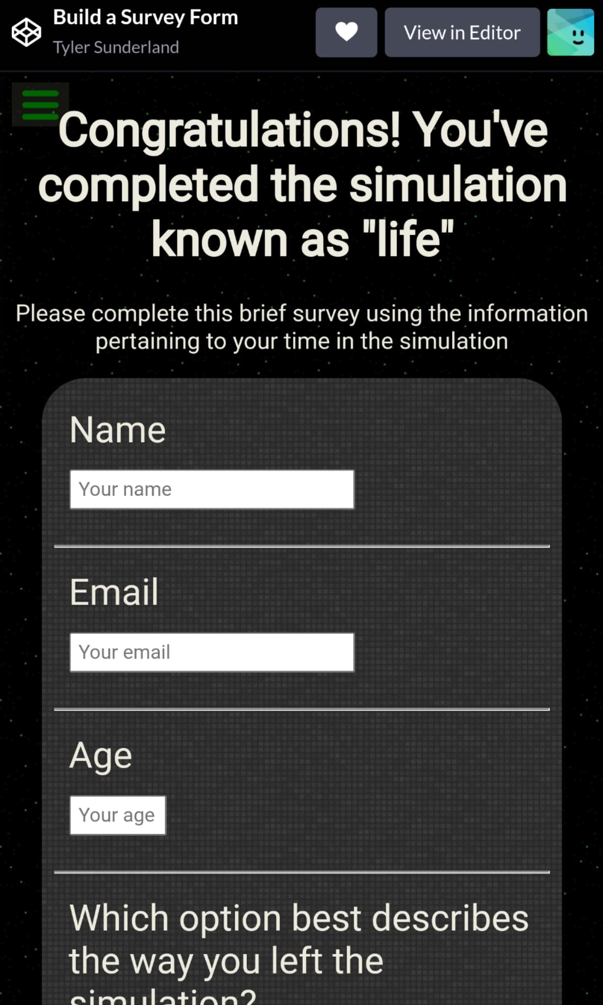
One question, can you actually read any of the content on the page? Because I can’t. From what I’m looking at, your font color is just about the same as your background color.
Yep, that’s it! I’m not sure you can link to google drive images like that. I think a lot of people use github to host their images. I would look into that.
I went ahead and used GitHub. Hopefully it’s fixed now 
Doesn’t work for me. The image links don’t work. Maybe because your repository isn’t public, I don’t know how github works with images and links…
I personally use imgur or some other image upload websites.
Okay now it’s fixed! Thanks for pointing out this mess lol. I tried imgur in the past but eventually imgur blocks the request for the image to show. I made the github repository public so hopefully the images will keep showing.
I also shrunk it down a little on bigger screens. Thanks for pointing that out!