Hello all! I would love some feedback on my survey form. This didn’t take me as long as the tribute page (excited about that!) and I feel it looks better in smaller screen sizes - but it is responsive. It also doesn’t have a subject, just placeholder information.
It looks good @nekochan34. I like your color choices. Few things to possibly revisit;
since it’s so small move it up a little so it doesn’t require the scrollbar. You have enough real estate to make your form fit fully on the page
don’t use the <br> element. Use margin and/or padding in CSS instead.
your labels aren’t closed correctly…(should be </label>)
add labels to your radio buttons and checkboxes so users can click on the label name to make their choices
change the cursor to a pointer when hovering over the Submit button
codepen provides validators for HTML, CSS and JS. Click on the down arrow in the upper right of each section and then click on the respective ‘Analyze’ link (A missing attribute in HTML)
i’m doing these projects as well!!!
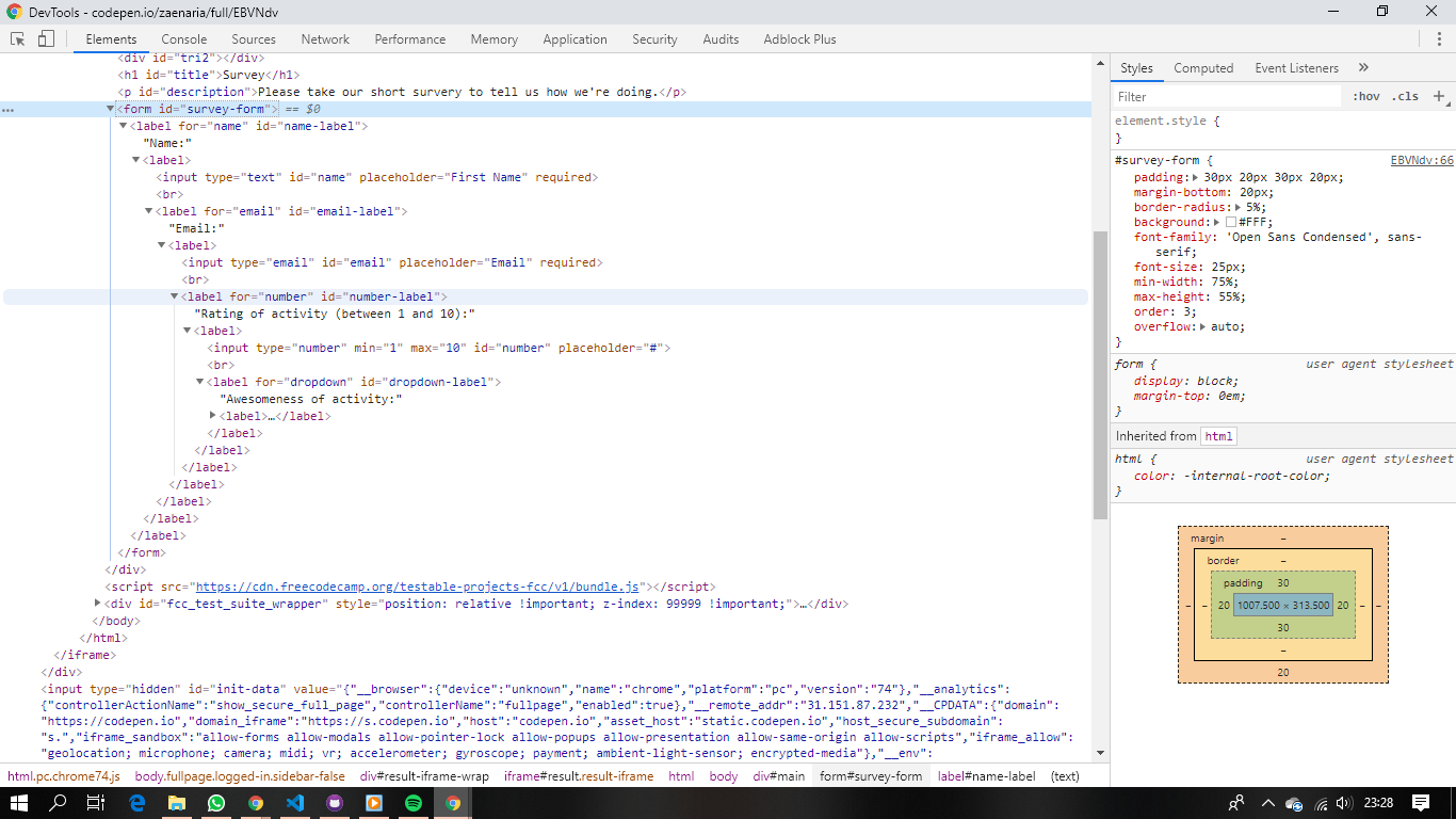
Can you explain why you have a <label> within a <label> within a <label> within a <label> within a <label> within a <form> ???
@nekochan34 Nice page! I love the background. You made the form look visually interesting, more than most of the other ones I have seen, including my own.
I recommend formatting the fields, checkboxes, and radio buttons better.
thnx! looked up the codepen source code. and you’re right. what i “scrn shotted” was after the browser interpreted the code (or so my hubby told me 5 mins ago)
I see now indeed that the Liz didn’t close her <label> tags
Thanks for the text-shadow trick! Not sure why I didn’t know that but it really makes the text pop - especially since I didn’t want anything other than white for the title