Looks cool, really nice.
Layout is working on desktop, very good. But for mobile you need to consider padding/margin affects final required space for an element, I’ll explain.
The white color for coloured background brings good contrast, and it’s readable.
Placeholder for input elements, very good. (but not for textarea, add it)
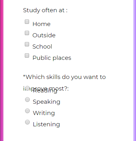
The second combobox comes with no any default option selected, while the first one comes. Add one non-selectable option for first combobox as default selected. Also mark the first element in second combobox("–choose reasons below–") unselectable.
Text fields, text area and submit button come with border-radius, except the combobox, I think applying same border-radius value for combo boxes will make it more better.
Radios and checkboxes come with no associated labels, so bad, fix them.
You also set some font-size in pixel, I suggest you don’t. let the user/browser uses his defined default font size. if you like to bring larger or smaller size, user em unit to do so.
I also realized you set constant absolute height for your .left class. This makes troubles for you, please don’t, seriously. check one possible issue:
Same story about input fields, they got constant absolute height values.
.left class also has 100% as width for mobile (by media query), this is not required, and actually makes troubles. by default divs go fit the parent. remember 100% may causes scroll. for having fit(100%), this is better to not see if the element goes fit by default.
class .container has some issues, please note 70% as width with 50px for padding could make issues for mobile.
For mobile 50px padding is a little too much, beside please note by default 70% will be calculated by applied padding with (50px left+50px right) and margin(if any), so it could simply causes scroll for small screen, check:
One simple fix is telling the browser to apply the width without applied padd/margin using box-sizing: border-box;, but as this fix the scroll, but still 50px is too much for mobile, same you may go more than 70% for mobile, check:
.container {
/…other attrs…/
box-sizing: border-box;/may not cause scroll/
}
result:
Looks bad? yes, too much waste of space, also that height of 30px brings more issues.
Fixes are so simple, first never force a text(or floatable) element with fixed height/bound(you got the result), so remove the height:30px of left class.
Also you may go more wider for form in mobile, with much less padding, my suggestion:
.container {
background-color: white;
/* border-radius: 10px; /
/ width: 95%; /
/ padding: 50px; /
margin: 0 auto;
/ box-shadow: 3px 3px 20px white; */
box-sizing: border-box;
padding: 0.5em;
}
More suggestions, for mobile: removing the box-shadow for main form, same the border-radius.
NOTE: by default browser applies a small about of margin to body tag, you may override it if you like to place an element starts from zero index(edge)
body,html{
margin:0;
padding:0;
}
Adding some padding for input elements would be great.
And now check the new layout for mobile
I think it now looks better now.
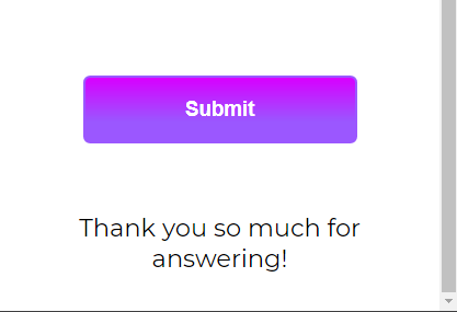
Another suggestion is using the same background colour you used for the background, for the submit button too. Same about the foreground color. It gives you a good sharp contrasted element to your design. like this:
Keep goin on great work, happy programming.


