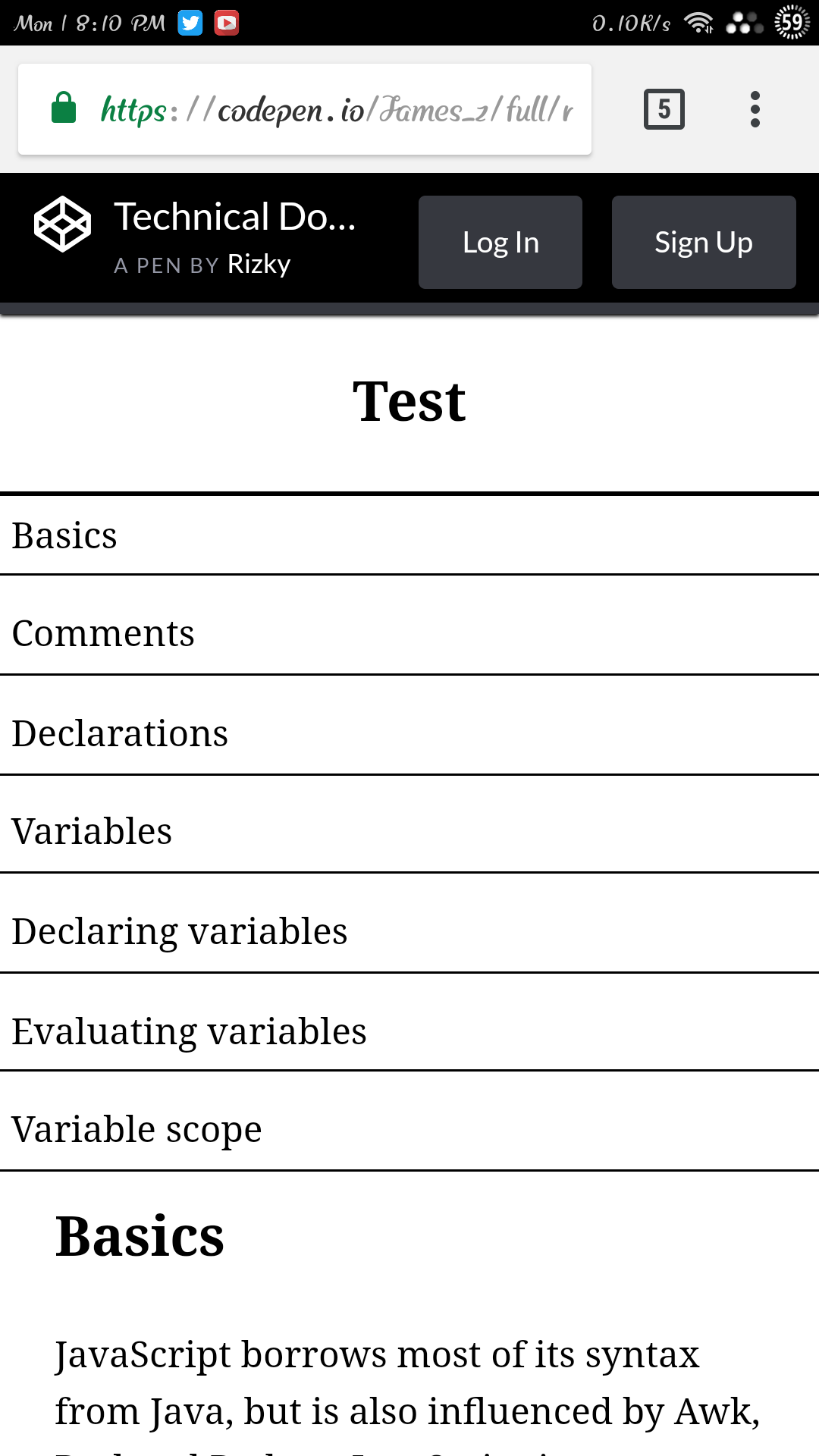
I want to make my navbar to be scrollable vertically in mobile device but I am still unable to make it work,I also want the desktop version to be scrollable,any workaround with flex or grid ?
Any help will be greatly appreciated 
I want to make my navbar to be scrollable vertically in mobile device but I am still unable to make it work,I also want the desktop version to be scrollable,any workaround with flex or grid ?
Any help will be greatly appreciated
Add overflow-y: auto to .sidebar
Also there are reasons in html on usage of tags, you have used header tag in your navbar, you shouldn’t do that, instead use h1 to h6 tags or p tags for content title or text,
Look at this article,
https://developer.mozilla.org/en-US/docs/Web/HTML/Element/header
Thank you so much for the help,it kinda works now,but there is still a few problems left,there is big whitespace bottom of the navbar,also the scrolling in the desktop version is jumping,I want the navbar to be like https://codepen.io/freeCodeCamp/full/NdrKKL
I don’t see any, can you provide the screenshot of your problem
Did you update your codepen…?
EDIT: I see the problem, let me go through it
Since you have set the height to 50%, the rest of the content gets hidden, give the height of 100vh
Thank you  ,fixed it,but now is it not scrolling anymore
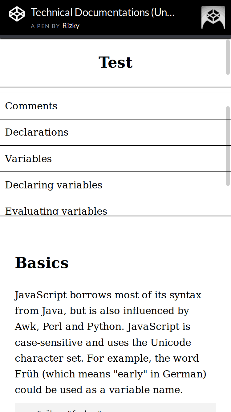
I mean I want it to look like this https://codepen.io/freeCodeCamp/full/NdrKKL
Then you have to restructure the code, make it as,
<nav>
    <ul>
        <li><a></a></li>
   </ul>
</nav>
Give the nav as fixed and apply the properties i had mentioned, and give it a try, if you get stuck come back here, we would help you
It works,but there is a big whitespace below navbar,also how can I add scrollbar to navbar ?
You can set that still, by giving the navbar a height of 70 or 65% and apply overflow-y scroll on navbar and remove the overflow prop on .sidebar
You can remove the space by setting the margin-top of the main to some -200px or -150px
Fixed,but now desktop version is broken,half of the main text is disappear to the top
Use media queries, for smaller width
Thank you,I will try it tomorrow and report back
Everything seem to work perfectly now and responsive,but when I try it on my phone the scroll is not working at all and the height is not applied,can you please check it on your phone,I have updated my codepen.
HI @James_z let me check it
I see this in my mobile, entire menu is displayed, try reducing the height further and test it in mobile
And i see this in my dev tools, you see if the height is small, the scroll gets displayed
Thank you so much,I just fix it,I am still curious why when I use percentage it work in the dev tool,is the dev tool not accurate,can you please explain a little about this