I haven’t asked for it yet though it was completed a while ago.
I appreciate the feedback.
Looks better in computer although it can be seen in phones.
Thanks!
https://codepen.io/33P/pen/zYrmxad
@33P Nice site! I like the design, really slick. You’re art is beautiful. I wonder how it would look to have space between the sections so you can see the background image as you scroll down? I also used the HTML/CSS analyzer (just found out about that tool!) and there are a few HTML errors (missing closing tags) and one CSS error (missing closing bracket).
Cheers! -HiL
2 Likes
@hilbug Thank you for your feedback mate! I’ll try your idea of the background image! I’ll run the analyzer to find those errors you mentioned and correct them.
Cheers and thanks!
@hilbug Hey, it’s a strange thing that I’ve tried and tried and cannot get rid of the css error “Unexpected unknown type selector: iii-iv”.
If you have any idea or someone else has it, please tell.
Everything seems to be working though in the site.
Thanks!
1 Like
Hi 33p I visited your website and also I’m new in web development (I’m doing the css challenges right now) so keep in mind that
- The things that I really liked about your website
- It is really clean , smooth and sight friendly
- I liked the hover effect on the gallery’s images
- I LOVED the about me section , the short description about the things that you like were great plus the image next to it , 33p you nailed it
- I visited your tribute page about The Velvet Underground , and I realize that you did a great progress , be proud of it
- The things that you can do for making it better (based on my newbie opinion)
-
When you put the cursor/mouse over the gallery image it appears a button wich say “Full-sized image” , then you put the cursor/mouse on the “Full-sized image” and the button makes bigger . It’s bothering that you have to wait 3-4 seconds until the button makes the full animation.
My advice is that you make your animation quicker , don’t touch the fade out effect , is great -
Would be great if you apply the same effect on your Project’s images , because the zoom out or zoom in (I don’t remember the effect’s name ) is really slow , and for the text you can just change de color of it when you hover on it instead of zoom in or zoom out
-
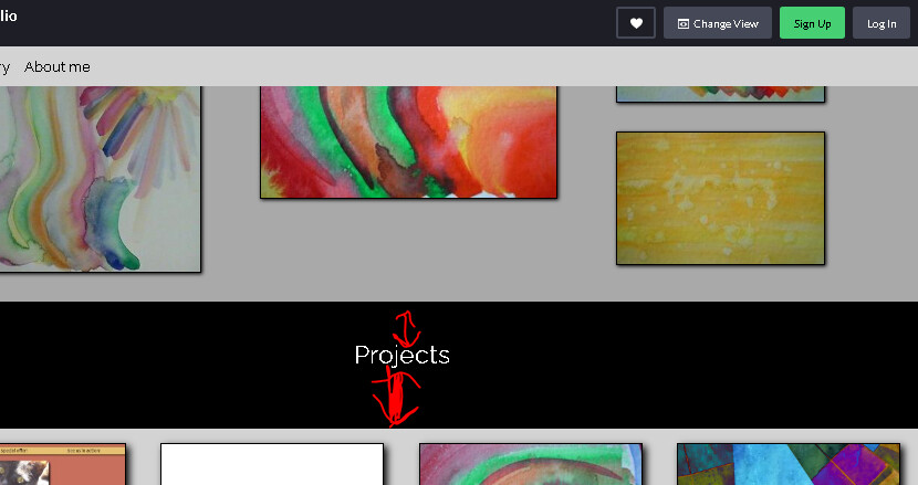
The padding or the margin isn’t right here, doesn’t look the same , and it should
You can realize that the space (the padding or margin i’m not sure) underneath or under the Projects heading is bigger than the Gallery heading
-
I’m a book enthusiat, and I would love that you can give the users the link to go to your poetry books on Amazon or wichever site that you uploaded your books . I know that may be for personal reason you keep your books private because you’re the author but I think that most of the readers out there would love to read your poetry and may be them would like to know more about you.

I hope that this can help you , you’re making progress keep in mind that , be proud of it , great website (sorry for my english i’m studying)
1 Like
@ivansalinasramirez20 Hi, and thank you for taking the time to give feedback. You’re right about the difference between the section titles, I’ll correct that. The rest…well I like it better the way it is now. It’s best to showcase what I have learned until now and I like the little delay in the links to appear. Thank you!
1 Like
btw why do you publish your portafolio project on code pen ? In the challenges said that you need one to publish it?
Yes, it’s one of the projects needed to obtain the certification.
1 Like
@33P Looks like iii-iv is an ID in your html, so maybe try “#iii-iv”? When I added that, the error for that one went away but then the same error popped up for iii-iii. I think you should have the # in front of all your CSS selectors that are IDs. I am not sure why the formatting would be working without it to be honest. 
Also came across this error further down:
Unexpected duplicate selector “.view-image-text:hover”, first used at line 211
1 Like
@hilbug Thank you. I passed by it, gonna try and solve it. Haha I don’t know either.
Edit: Now everything’s OK and working as expected. And HTML and CSS have no errors. So thanks mate!
1 Like
I wonder how it would look to have space between the sections so you can see the background image as you scroll down?
Hi again @hilbug I’ve been pondering about this suggestion and came to the conclusion that it would clutter the site too much. Sometimes less is more and I think this is the case, especially because the gallery and projects section are so visually varied and distracting. But it was a nice idea for simpler sites. So thanks!
1 Like
This topic was automatically closed 182 days after the last reply. New replies are no longer allowed.