Hello Guys,
it was a struggle and took me some time but finally I have managed to finish the survey form.
Can I ask you for the feedback?
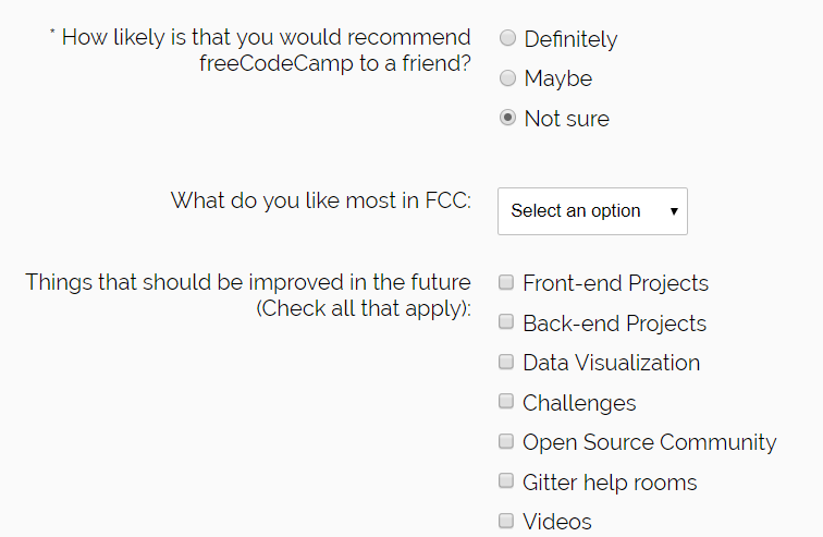
I made the form responsive based on the width of device less than 600px.
Thank you so much guys!
Hello Guys,
it was a struggle and took me some time but finally I have managed to finish the survey form.
Can I ask you for the feedback?
I made the form responsive based on the width of device less than 600px.
Thank you so much guys!
Hello Michael,
Just checked your work, and I liked the colour scheme so much, very great, neat and pro design, perfect.
But some issues too,
Radio buttons come without label tag! please fix.
Same about the checkbox, they come with broken label linking. If you check all labels for checkbox buttons are associated to first checkbox, please fix.
Layout is broken for desktop, since it’s working on mobile view, I was expecting viceversa 
I just found one weird CSS coding as following,
.grid-container {
    margin: 20px 20px 20px 35%;
    display: grid;
}
That margin could break your layout very very easy. why? also considering rest rules
.container {
    width: 100%;
    margin: auto;
}
So it’s easy, 100% + 35% for padding will break your layout very easy.
Please remove that margin, and it’s fixed. The way you try to center the content with this way is not logical and bad way.
As your form goes one element for each row(line) you don’t need grid display/layout at all!
Just place each label and its associated input in one div, as div displays as block, ir automatically perform line break for next element.
I suggest you rework the layout please.
I see you set default value instead of placeholder for the textarea, please fix. Don’t use default values as placeholder.
You may have a quick read on this survey form challenge walkthrough article comes with some sample and template layout could help you to rework the layouting.
Overall good work Michael, especially the smooth design, I like it so much.
Keep going on great work, happy coding.
Hello my friend!
I really appreciate your time which you invested in reviewing my project!
Also I came throught your blog post regarding the survey project and I like it a lot - good job!
Even though I wanted to spend my Sunday on next project - landing page I took a shot of coffee and dive back into the survey to make the corrections.
I managed to correct everything from your list except the overall layout because from the beginning I somehow struggling with the centering all the elements to the middle.
This is why I have there the “bad logic” code inside - I took it from somewhere else and applied just my situation because I did not know how to center all the elements to the middle.
Now I wanted to get rid of the
.container{
  width: 100%;
  margin: auto;
}

.grid-container {
  margin: 20px 20px 20px 35%;
  display: grid;
and replace it with either:
.container_i{
    display: flex;
    justify-content: center;
  }
or:
.container_i{
    display: block;
    margin: auto;
  }
but it still does not work and I think my intention is incorrect.
Can you please also help me with centering elements like a set of checkboxes to the middle in my case?
Thanks again my friend 
Good working,
This is easy, I’ll giving you a hint. For centering inline elements like span tag, you may simply set text-align:center to its parent, considering following example:
<div style="text-align:center">
<span>I'm a centered text</span>
</div>
One retro old way is using the center tag. anything you put inside the center tag will be centered, example:
<center>
<span>I'm a centered text</span>
</center>
But text-align:center won’t work for block elements like div. By default block elements tend to fit with their parent, considering following example.
<div style="background-color:yellow;padding: 1em 0;">
<p style="background-color:lime">Paragraph is a block element</p>
</div>
But when a block element comes with smaller width than its parent, then by default it is tent to follow the page direction, and gets moved to either left or right of the page. example:
<div style="background-color:yellow;padding: 1em 0;">
<p style="background-color:lime;width:80%">Paragraph is a block element</p>
</div>
You see the paragraph is 80% of its parent width, and it’s placed at the left of the page(left-to-right direction).
Here giving text-align:center to parent(div) tag won’t center the paragraph, but may center the text inside the paragraph(they are different), so how to make the paragraph centered?
You may ask the browser to apply equal left and right margin to the paragraph tag, so it will be automatically get centered. using auto, example:
<div style="background-color:yellow;padding: 1em 0;">
<p style="background-color:lime;width:80%;margin:0 auto">Paragraph is a block element</p>
</div>
Please note the margin:0 auto, it means apply 0 for top and bottom margin, and auto for left and right. here auto calculates the reminded/available size at right and left side, and give equal margin for right and left sides.
Please note as text-align:center won’t center any block element center, so margin:0 auto won’t center any inline content too.
Now if you give a background colour(for debugging) to your .grid-container, also remove the faulty margin: 20px 20px 20px 35%;, and use margin: auto;, you still see contents are not centered, becasue let’d note it again, a block element fits with parent width, so since there is no space at left and right, margin:0 auto won’t affect.
Not add one more attr as max-width:5in you will see some changes. Note The background-colour you added for debugging, it tells you the block is centered, but the content is not.
Now do the same process for the inline content, go for margin:0 auto for input elements, and text-align:center for text parts.
What I got for debugging:
TIP: I always start coding the pages from layout. Don’t add any content, just layout. Give each container/section a unique random background-colour, and test with different screen sizes(simpel resize the window) to see if each section/container is moved and advanced(sized) correctly. Later when you find the layout functioning, add content one by one.
I believe you can Michael.
Feel free if you need more hint. Be patient, and keep going on great work. Happy coding.
Thank you again!
I appreciate your feedback especially the best practices (background color for debugging and starting with pure layout in a case of new projects).
What I did is that I removed some parts of my code which being irrelevant now.
Also as your feedback I changed the background color of my containers to see how they are positioned. Then I spent 45 minutes by trying to find out why my containers including lists are positioned a bit to the right (you can see it in my codepen) in compare with other containers which I believe are centered correctly but I did not find any reason unfortunatelly by my own 
Also I thought that if I go to the label for example for “*Name” and give to either label class with text-align: center or give it a <p and inside it to give it either by class or by inline styling text-align: center it would be aligned but it is not my case…
Did you use for any type of display to center my elements?
When I delete the display: grid it seems like everything gets more messy 
Thank you again for supporting me in this journey
Very good progress
so happy you could find the background color for section useful, indeed it helps.
This is becasue by default ul tag adds some padding at right, This is easy to fix, find the ul(list) tag, and add css as padding-left:0 and it’s awesome now.
Yes I understand, I’m telling you to center everything comrade, if you think the current centered block is what you want, so it’s already awesome, let it be awesome.
I believe you have already got it, I used no display, and let the default block goes there. Read my previous replies I suggested if you like the flow layout(each line/row one block) so you won’t need any grid/flex stuff, just let it be as block, put items one by one. But note inline elements like text, inputs won’t go to new line, so if you put the inside a div, the div will applies a new line. Just as you did the rick by setting display:block for input, good move.
Even for your mobile view, you won’t need grid/flex with the way you put elements right now. Actually you don’t need any media query for this.
check this very simple layout template, see the code, it’s super simple, no fancy layouting, no media queries and it’s working as expected. Don’t take the stuffs complex comrade.
Keep going on great work pal, happy coding.
Good morning master,
what I achieved is that I centered the text items as you proposed yesterday. The mistake I cannot center the text was that I applied text-align directly to the text not to its parent (good learning).
The only thing I am missing now is (for me) cursed input elements and its centering.
I understand that I should apply margin: 0 auto; to the parent of the elements which are in my case
.form-format{
  background-color: white;
  width: 90%;
  height: 95%;
  margin: 0 auto 20px auto;
  border-radius: 5px;
and:
.grid-container {
  background-color: pink;
  margin: 0 auto;
  max-width: 600px;
}
however even though I have there everywhere applied margin auto so it supposed to center the elements based on the culculation of remaining space in the container my inputs nor lists are not centered. I have centered lists just based on the text but as you mentioned already above this does not work on inputs
Can I kindly ask you again for the navigation why my margin auto is not applied on the elements mentioned above?
Thank you a lot
Grreat progress.
Nope! if you check the sampel code I provided, you for block like elements(like input in your case) the margin:0 auto should be applied for the input itself, not the parent.
You got it right about the text-align:center to be applied to the content parent, but it’s not the same for block like elements.
So go for margin:0 auto and make those inputs centered very easy.
Happy coding.
Hello friend 
I managed finally to center all the input elements! The thing I was doing wrong all the time is that I have been creating rules for the centering in class and then applying them instead of putting them directly to the input in css - fantastic learning.
The only missing thing with what I struggle is the text next to checkboxes and radiobuttoms.
You can see that I have centered checkboxes but I cannot find the way how to have their description next to it.
When I center the describtion with text-align method it goes under the checkbox. I think it does not have space for some reason to fit next to it or it has something to do with display: block of my checkbox input type…
The 1st text is center by text-align, others are not:
Can I kindly ask you for your guidance also here?
Thank you soooo much!
Good progress,
Please find out the CSS rule you applied for checkbox buttons(line 56), you will find out why label of checkbox goes to the next line.
Hello my friend
initially I thought that I will center these checkboxes and radio buttons as per the showcase in the project:
It looked to me that this is centered via some display method but I checked now the code and can see that there is used just a offset from left side in pixels and therefore it does not hold the ration or something .radio, .checkbox { position: relative; left: -43px; margin-left: 10px; display: block; padding-bottom: 10px; }
I think I will just leave my survey form as it is since checkboxes and radio buttons are centered and hold ratio in a case of different screen size.
However thank you so much for helping me to realize my mistakes and guiding me to solving them