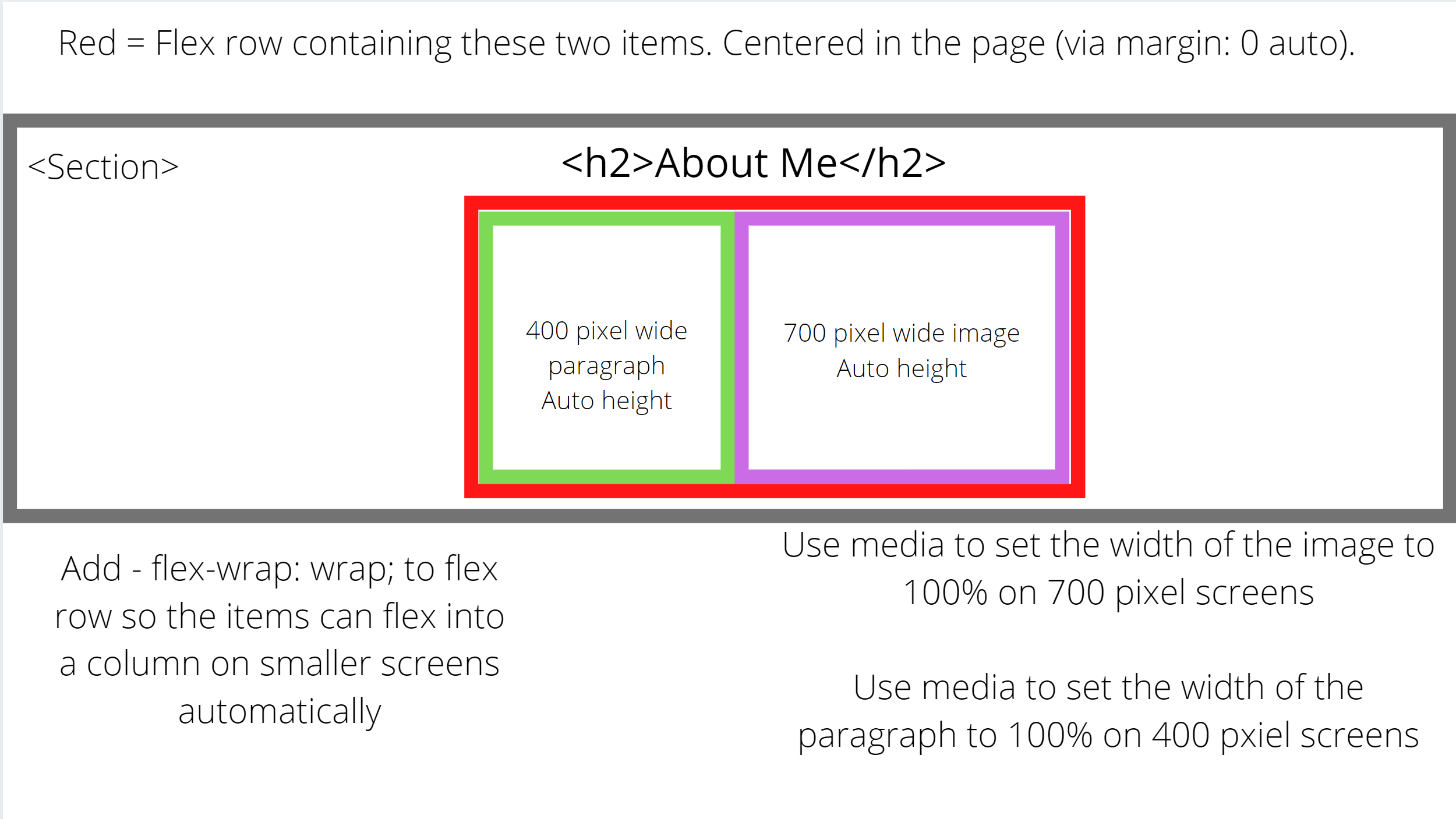
I would suggest adding more content to fill up the about section (image next to text that can wrap to a column on smaller screens).
Add a gap between the project image and text (if using flexbox, use gap property).
Increase the size of the text in general, especially for the titles.
The white background with a white “projects” title does not have enough contrast. I would use black text instead of white. Use white text on a black (and/or dark) background.
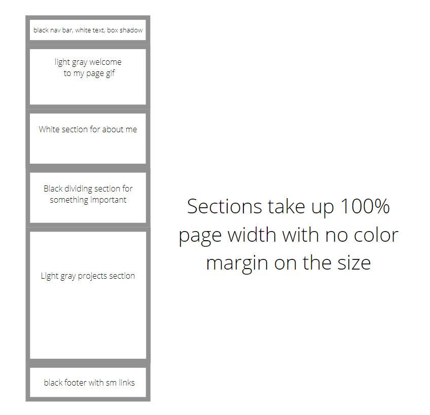
I would suggest switching out the gray for black. Making text that contrasts well with a dark gray background is not easy. White does contrast, but it doesn’t look good. Black text contrasts, but it is hard to read. You are also using two different colors of grays for the page, which does not contrast well for the color scheme. Use black, white, and a light gray. Using white, gray and darker gray does not separate the page well.
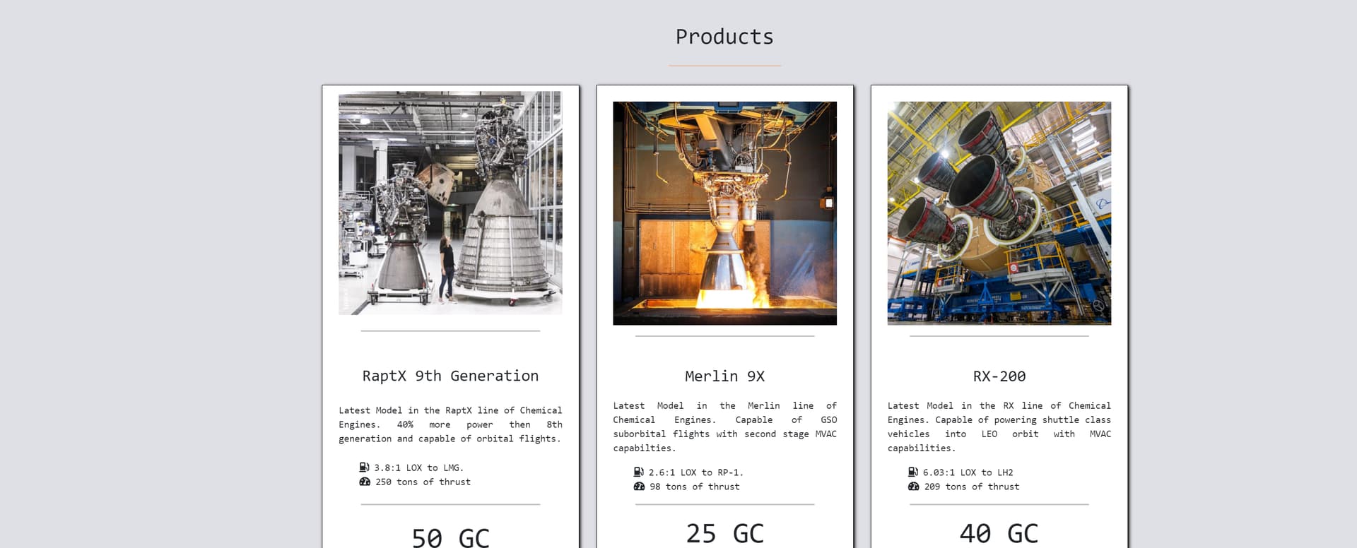
For example, on my product page (link) I used a black background on white text and was able to create a good contrast:
If I did use gray, it was a very light gray:
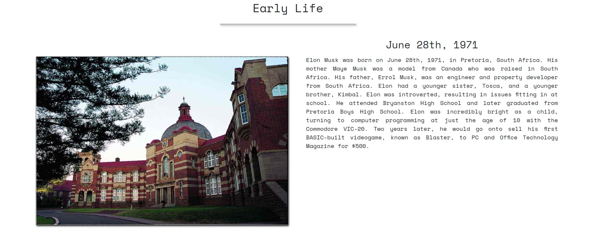
From tribute page:
My gray colors background-color: rgb(223, 223, 230);
All the RGB values are high in this color, resulting in a color that is high in brightness. This allows for a gray color without becoming too dark to defeat the purpose of using black.
I only ever used black on my tribute page to create breaks in the page (the quotes).
It acts as a good division and stopping point for the user. It also helped me to divide up big white sections and big gray sections.
Most of the text should fall under white or light gray backgrounds. Too much reading of white text on a black background can strain the users eye after a while, so it should only be used for bold content. If you look at my product page, I used a black background to make the video more bold. This pulled all of the attention away from the other sections and focused it on the video, creating a better experience. It also provided a good transition to my products section.
As a result of this, try making your about sections either white or light gray, rather then a black background (if you do decide to follow my color recommendations). I would suggest creating a new black background section between a white/ gray about section and the white/ gray projects section. In this new section, include a quote, picture, or something else important that all attention should be on it. This can help break up the page.
Nav bar will have box-shadow: 2px 2px 5px black; Also make that logo smaller. Use only the “designs 63” part of the logo, as we already know your name from the opening part of the page. This will make your nav bar have less height and be less intrusive. Then make the nav bar text bigger and center it more.
Use text-align: justify to force text to take up a certain amount of space in a container.
For example on my tribute page (link) I wrapped the text in a div and gave it a set width such as in my diagram above (last reply).
I then gave it a justify alignment so it took up all of the space.
Find a better font. Use google fonts (https://fonts.google.com/) and search for a font style you like in order to best fit the theme.
I would suggest using space mono:
@import url('https://fonts.googleapis.com/css2?family=Space+Mono&display=swap');

body {
  padding: 0;
  font-family: 'Space Mono', monospace;
  margin: 0px;
}
It is a font that looks more futuristic/ computer science related over the text you would read in a virtual book.
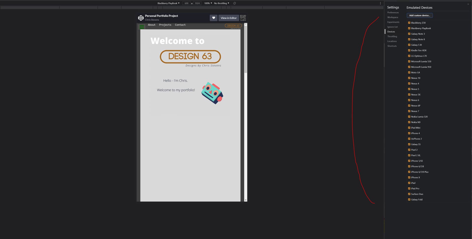
Use developer tools to test your webpage on different sizes.
- Press f12 on chrome and hit the tablet icon
- Select the size of the device to test. You can hit responsive to manipulate the size yourself, or select a device to test.
- You can also hit the ‘edit…’ option to find more devices and add them to your device list.