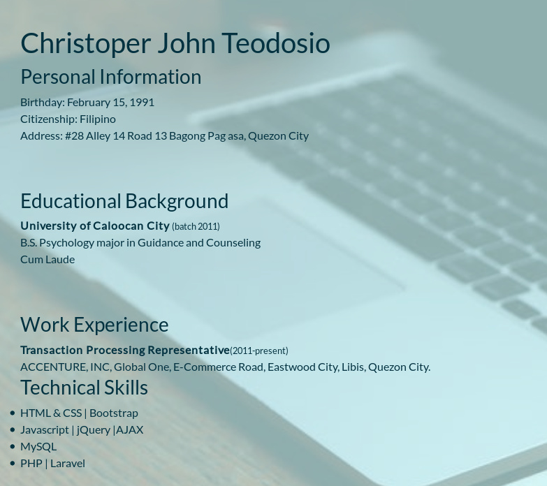
Kindly critique this old portfolio of mine. https://teodosiosiege.github.io/portfolio/ . I have been going through freecodecamp to add projects to this portfolio when I stumbled upon the portfolio project on responsive web design certification. I’m mulling of whether I should just refactor this or start from scratch altogether. Do you guys think this is good enough? I am not confident with the design decisions I made when I created this. Please help!
The first thing I noticed is that the text is kinda hard to read on the about page. I do like the parallax effect you have though.
Thanks! I’ll work on my typography.
Please try to add a black overlay or something to the background image to improve the readability on about and portfolio page.
This might be helpful: Perfecting Contrast in UI Design - Beginners, GET IN HERE NOW!
Good luck.
Hi Siege,
first, I really like the design of your page! Why have you chosen a picture of a sky? I mean, it’s beautiful, but has it any meaning to you? Two of the project links aren’t working. Also, I find it a bit confusing that you have two names. And please please please choose a picture where you are smiling  Apart from that I really like it!
Thank you! I’m working on it now.
Hello there, looks great! I particulary like the music instruments site. One thing I would say is, I don’t believe it is recommended to put a picture of your face on your portfolio, just because people are biased and you want it to be about your work, not your age/race/sex etc.
On your main page directly beneath your photograph there is white text on top of a lit up keyboard background that is difficult to read.
You know how you scroll from section to section, don’t you think it would be cool if you scrolled one click on your mouse and it instantly moved to the next section? Just a thought.
I feel like of all parts of your portfolio page the visually weakest is the landing page, You don’t want that to be the weakest, although I don’t have more specific ideas on what could be improved, I just feel that your site starts looking much better as soon as you scroll.
also if you have any thoughts on mine I’d love to hear them! Thank you!
Oh hey, the about page is much more readable! It seems to be more consistent with the color theme too.
I thought of some other things as well.
-
The about and project pages span the entire width of the screen on desktop and they don’t really need to. Maybe give them a max-width and center them. The picture below is an example I made by editing with inspect element
-
On the about page, the bullet points don’t line up with the rest of the content.
-
On the mobile site, the buttons are stacked right on top of each other. I think they just need some vertical space between them.
I think this : FullPage.js – Create Modern, Scrolling Landing Pages Easily! will help him achieve that full-page scroll you’re talking about.
Thank you! I really like astronomy as a kid so I have chosen the image for my personal page. I was actually thinking if its appropriate though. What do you think?
Also, please verify which projects has broken links? It works fine on my end so I need to double check.
Siege is my nickname btw and would prefer being addressed as that. But employers might require my full name so I have included it as well.
Thank you for your suggestions! I’ll work on it!
Oh, that’s a good reason for choosing the picture! I like it!
The Musicore and the Finessa pages weren’t working, but now they do 
Thank you for your inputs!
It is actually standard practice in my country to give the information you have mentioned in the resume, so I figured I might as well save them some time and put it on my portfolio. I will look more into this since my goal is to be a remote developer, so I need to familiarize myself with conventions from other countries. Thank you for the insight!
I will try to improve on my landing page. Can you suggest some sites where I can get inspiration from? So I can incorporate those ideas on my portfolio.
Your portfolio looks awesome! I am hard-pressed on making comments with any merit. But I must say that my computer lagged a bit due to the animation. It might just be because of my internet connection though.
Thank you for your advice!
I made some adjustments based on your recommendations. Let me know if I can make any more improvements.
@akashrajum7 Thank you! I will look into this video.
@Mareike91 Thank you for your input!


