Sorry, this took me a while to composite:
Okay. I just want to give you some easy tips on how to make almost any site better, quickly and easily, even if you are not very comfortable with design. You can use pictures that fit the theme of the Project, or for something like this, Just chose a photo theme that you love.
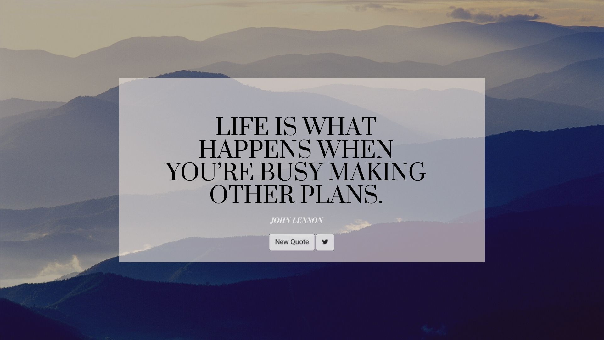
FIRST:
LARGE, BEAUTIFUL, HIGH RESOLUTION IMAGES CAN IMPROVE MOST PAGES:
If you have a lot of open space on your website, it can be a good idea to fill it with a “hero” image.
THESE KINDS OF HIGH RESOLUTION PHOTOS, CAN BE FOUND FOR FREE USE, ON PLACES LIKE:
PIXABAY https://pixabay.com/
UNSPLASHhttps://unsplash.com/
PEXELS https://www.pexels.com/
CREATIVECOMMONShttps://wordpress.org/openverse/search/image?q=mountains
WIKIMEDIAhttps://commons.wikimedia.org/w/index.php?
search=mountains&title=Special:MediaSearch&go=Go&type=image
SECOND:
GOOD FONT: Good Font can help make a page look more Professional, Elegant, Interesting, Cohesive and usable. In the case of your project, you could play with the size and type of font.
And remember, because in this case the Quote font is the centerpiece of the site, choosing a large, good font, would be a Good Idea…
GOOD FONT:
These days, good font is easy to find, because places like Google fonts make it easy to use, and free.
Here is a VIDEO walk through, on how to use google Fonts if you are not used to using them :
THIRD:
CENTERING:
For a beginner of design, sometimes it’s easiest and most graceful, to use Center alignment of the largest fonts, and main Items on a site.
As a general rule most things look better when centered, though there are definitely some exceptions.