Tell us what’s happening:
Describe your issue in detail here.
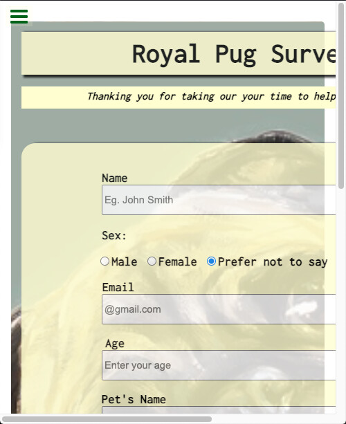
I’d like some honest feedbacks regarding my Survey Form… Either with the code or the design. Thank you. Your code so far
Your project passes all tests, that is good so great job on that front! Starting out with your code, something very minor as it is functional as is, but more a general rule of thumb when creating code pens…You are including the freecodecamp tests as well as google fonts within the html portion of your code. These are better suited to be added within the settings of your specific Codepen.
I notice that you use a significant amount of semantic html by adding in labels and placeholders for your form. You’ve also added in a number of <div> tags throughout your html. You should look into the natural effect that these container elements have by default on the page. Look into the display property of block, which is by default how a lot of elements appear on a page. Many times you can skip the <br> tags by using this property to your advantage.
You experimented with opacity on some of the elements which I think makes it appear more modern. With that said, there is room for improvement within the design. One major design flaw is that there are not any viewport breakpoints, so when the browser width shifts to become a narrower size (often the case with mobile devices and tablets), it does not adapt. Look into CSS Breakpoints to make this change. There are some things you could do that you may not be aware of that I believe you might enjoy from learning. For example changing the margin of body to 0.
body {
margin: 0;
}
Applying this change will eliminate the white area around the background photo. With that said you might even enjoy this suggestion even more. You could apply your background photo with the attachment property set to fixed. What this does is causes your background image to “float” in the same position no matter where the viewer scrolls. Check this out.
#main {
background-attachment: fixed;
}
The textarea for comments or suggestions is resizable beyond the width of the screen. You can achieve this result by using the max-width property on this element. You might do well with some min-width and min-height properties set as well.
Your form looks good @teamie. Some things to revisit;
Codepen provides the boilerplate for you. It only expects the code you’d put within the body element in the HTML editor. (No need to include the body tags). For anything you want to add to the <head> element click on the ‘Settings’ button, then HTML and add it into the ‘Stuff for <head>’ box.
For instance links to fonts go in the box labeled ‘Stuff for <head>’
Thanks alot @Roma I checked out the W3C validator and was able to identify some errors I made… Will make all required changes. It’s my first time coding and I kinda got too comfortable using <br> to break lines I think I can use the display property in CSS for that… Thanks for your suggestions, really goes a long way.