Just looking for feedback and suggestions on my Survey form. Let me know what you think.
1 Like
You’re doing one project a day now? 
I like it. Suggestions for improvements would be to vertically compress it slightly (I.e. by smallering the form grid-gap) so the user doesn’t have to scroll too much. Further eventually improve a bit the default designs of the form items.
The content of the submit button exits it’s container on smaller screen widths.

Other than that the page is functionally great. Hope this helps you.
what browser are you viewing it in and what screen size did you shrink it down to to make it do that? I start my projects at 280px wide and I have a min-width set to around 260px on the entire grid… so I have no clue how that is happening. Glad you caught it though, thanks :).
I’m actually on the Javascript Calculator now… My brain needs a couple days vacation from it lol. I haven’t been posting my projects in here for feedback so I figured I’d go back over them nit picking and polishing to keep my coding mind active but AWAY FROM THAT CALCULATOR!!! lol.
I understand what you mean about vertically compressing it though. The reason I have it spaced out as far is because I personally felt it was a little too clustered, maybe finding a good place in the middle will work. On one end I wouldn’t want the user to have to use extra brain power to separate and distinguish things before processing them, but then I do indeed want everything to be as visible as possible on the screen. I’ll poke around at it, thanks for your feedback.
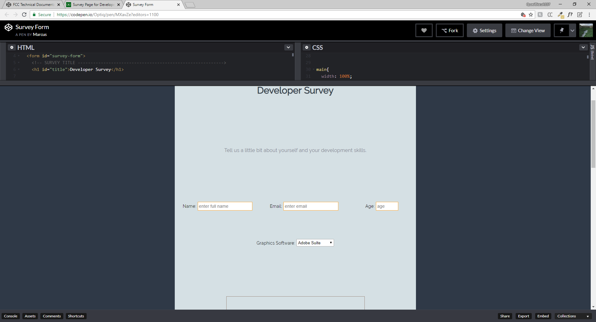
ok another one for “too much space”… hmm… I already explained what led me to wanting to have that much space before so I don’t want to go all through it again… maybe I can think of another way to separate them visually so they don’t crowd together when being closer. thanks 
Sorry @Optiq01 , the submit button exits the container on smaller screen ‘height’ (not width). 
Even then is the amount of space that you currently have needed? It would look twice as better if you just remove half of the margin.