I love it, it looks very nice and professional! Did you use flexbox or grid? The middle box “watch the socks” can you not make it in equal length to others? Thats the only thing I can think of right now. Was it intentional?
I used both! The header and footer are built with Flexbox.
The about me section is built with CSS Grids obviously. The projects section is built with CSS Grids mostly and a bit of Flexbox too
For the middle box, I noticed the problem and I’m still not able to fix the problem, so if you have a solution…
Really cool, great project ‘panel’, but the fact you used just pure css and html? Wonderful to me!
I noticed a tiny oversight in the random quote machine - check the text of the tweet button
About the columns height…I’m not an expert so I can think just to a workaround…maybe set a fixed height with an overflow property? I thought about some min-height: max-content but you would need to use something more than simple css to pass around the value
I love CSS Grid, I am planning to make my portfolio in it too. But I haven’t gone through JavaScript challenges and need to do that first! Have you checked the grid row? I don’t get it As long as columns are different for three boxes and rows are same, it should work? Have you tried that?
How did you manage to make make it mobile friendly? I know it is grid but I have struggled with that. haha
You know I made this very complicated design using grid, whic I love but it is not mobile friendly. So I am thinking of giving it a rest for few days and correct it. You can have a look here https://codepen.io/lexieroberts/pen/PaqMRV
Looks really great! I gathered the feedback from the other fellow campers and added my own so here’s a list!
Feedback:
The arrow button isn’t working I just kept clicking it hoping it would scroll me down ( not sure if you haven’t code it yet)
The text in the Random Quotes project needs to be fixed to Share or Tweet
The projects section needs to have all boxes in the same height
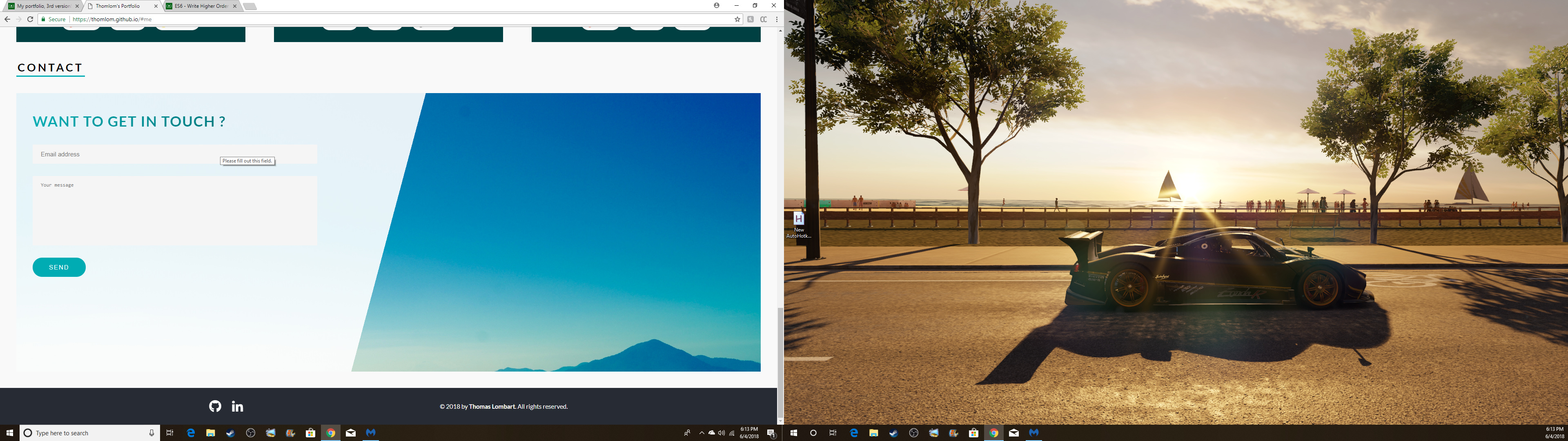
I would suggest trying other pictures for the Contact me section. Your portfolio is colorful and modern and I feel that image is dull (just my opinion thu)
Great job again. It’s an amazing project to do and you gave me inspiration as well!
I like it! It’s very neat and has a nice professional look. I like how simple it is to see the projects and the grid as well, even if I would have made the blocks more interactive.
I’ll improve the arrow button, I wasn’t sure if I had to code him. For me, it was just in order to warn the user there was content below! I didn’t expect people to click on it!
For the project section, I have to find a solution…
And I agree for the image, I’ll change it too. Thanks again
@Alessio95 Thanks for your feedback! How would you make them more interactive ?
Great job on fixing the issues! one last feedback after your fixes: maybe change the gradiant color for the contact me left section becuase it’s fading into the background (not sure if its what is intended). Also the form inputs are hard to distinguash from the background color. Maybe add a bit of a border or shadow?
I really like it. The look is clean and minimalistic yet different than most that I have seen. Also your use of color is impressive. You’ve got a good eye for it and a bright future ahead of you.
I like your project. I just don’t like how on full screen from a desktop you lose your mountain picture to the right of your contact me. Other than that, great job. Wonderful aesthetics.
I hope you can view mine as well and let me know what you think.


 )
)