So first thoughts - I thought the fade in was a little too slow. Then I was waiting for it to automatically slide through the slides, then I finally noticed the navbar and then I noticed the arrows. Maybe put the arrows next to the text more so it is obvious. Also the snow effect, might be a bit too much, the picture itself is gorgeous!
I also noticed it was a bit slow, it had to load between every slide.
As for your projects, even if there are only a few, as long as they are polish I think it would be fine.
Overall, it was interesting and eye-catching. If you could speed up the parallax somehow it would be awesome!
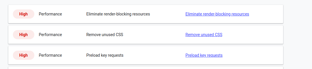
So I think I figured it out. Its the semantic-ui CSS library and font awesome icons. I’m only using like 5 icons and a dozen components from semantic. If I only import the ones I am using it will fix all three of those performance issues.
Stupid???
How can you say that!?!?
That’s the most impressive portfolio I’ve seen this month!
I’d just suggest you make the tree background fade in a bit faster.
It looks amazing! The usability on mobile is not the best, as you have to click in the arrows which are a little too high to reach on a smartphone. Maybe you could lower the buttons or find a way to allow users to swipe instead of clicking
It looks great to me. One thing I continuously found a bit frustrating was that the arrows were all the way at the top of my screen (mobile). I’ve got a larger phone, so it was pretty uncomfortable going through it. I think if you add swipe controls, that would seal the deal for me.
is the parallax screen cool or cheesy? It was nice and impressive.
what would you do to make it better? It was slow on some pages. Perhaps lowering the rez on your icons. No one is viewing this on a 25’ screen. Or don’t, it is only annoying when viewing with low bandwidth.
should the user be able to scroll back to the beginning or should it end at the last slide? The roll around was not confusing to me at all.
should the user be able to play duck hunt at the end? No
do you like the menu bar at the bottom? Perhaps drop a chevron down or add a highlight on each item to show where you are on the menu bar for wayfinding? You can access the pages without the menu so it was a bit confusing.
is the portfolio section impressive or does it need better projects? We all want better projects.
is the input validation experience adequate, annoying, or inadequate? It was a fine gotcha. However, I am not going to give you my last name till I talk to you. I don’ have a website, which is why I am trying to contact you in the first place. Also, you are the professional here why can’t you tell me how much this is going to cost? Why is this all mandatory?
overall thoughts and ideas? That is fantastic. I am giving you some comments as I experience your site but please understand that I found that very impressive.
Hej Jesse, your portfolio looks really impressive. Made with good style and taste. But I think that the sentence:
I think you will agree when I say that my UI/UX designs are not only beautiful, but simple, and intuitive as well.
Does not fit the overall theme. I think that the part about agreeing with you is unnecessary. Just leave it that you create beautiful and simple and intuitive UI/UX designs, because your portfolio shows that you do. Theres no room for arguing about that. At least in my oppinion.
I scaled down the three images that I am using for the portfolio screen,
they should load much faster. Ill have to check out the images, they all looked pretty tiny when I was looking at them, but I can probably still optimize some.
You are the first to provide input about the form, and I agree with your advice. I will try and adjust what is asked for and what is required.